Theme Color
You can customize your active Visual Studio Code color theme with the workbench.colorCustomizations user setting.
{
  "workbench.colorCustomizations": {
    "activityBar.background": "#00AA00"
  }
}
Note: If you want to use an existing color theme, see Color Themes where you'll learn how to set the active color theme through the Preferences: Color Theme dropdown (⌘K ⌘T (Windows, Linux Ctrl+K Ctrl+T)).
Theme colors are available as CSS variables in webviews, and an extension is available which provides IntelliSense for them.
Color formats
Color values can be defined in the RGB color model with an alpha channel for transparency. As format, the following hexadecimal notations are supported: #RGB, #RGBA, #RRGGBB and #RRGGBBAA. R (red), G (green), B (blue), and A (alpha) are hexadecimal characters (0-9, a-f or A-F). The three-digit notation (#RGB) is a shorter version of the six-digit form (#RRGGBB) and the four-digit RGB notation (#RGBA) is a shorter version of the eight-digit form (#RRGGBBAA). For example #e35f is the same color as #ee3355ff.
If no alpha value is defined, it defaults to ff (opaque, no transparency). If alpha is set to 00, the color is fully transparent.
Some colors should not be opaque in order to not cover other annotations. Check the color descriptions to see to which colors this applies.
Contrast colors
The contrast colors are typically only set for high contrast themes. If set, they add an additional border around items across the UI to increase the contrast.
contrastActiveBorder: An extra border around active elements to separate them from others for greater contrast.contrastBorder: An extra border around elements to separate them from others for greater contrast.
Base colors
focusBorder: Overall border color for focused elements. This color is only used if not overridden by a component.foreground: Overall foreground color. This color is only used if not overridden by a component.disabledForeground: Overall foreground for disabled elements. This color is only used if not overridden by a component.widget.border: Border color of widgets such as Find/Replace inside the editor.widget.shadow: Shadow color of widgets such as Find/Replace inside the editor.selection.background: Background color of text selections in the workbench (for input fields or text areas, does not apply to selections within the editor and the terminal).descriptionForeground: Foreground color for description text providing additional information, for example for a label.errorForeground: Overall foreground color for error messages (this color is only used if not overridden by a component).icon.foreground: The default color for icons in the workbench.sash.hoverBorder: The hover border color for draggable sashes.
Window border
The theme colors for VS Code window border.
window.activeBorder: Border color for the active (focused) window.window.inactiveBorder: Border color for the inactive (unfocused) windows.
The window border colors are only supported on macOS and Linux (not Windows) and only when the custom title bar is enabled ("window.titleBarStyle": "custom").
Text colors
Colors inside a text document, such as the welcome page.
textBlockQuote.background: Background color for block quotes in text.textBlockQuote.border: Border color for block quotes in text.textCodeBlock.background: Background color for code blocks in text.textLink.activeForeground: Foreground color for links in text when clicked on and on mouse hover.textLink.foreground: Foreground color for links in text.textPreformat.foreground: Foreground color for preformatted text segments.textPreformat.background: Background color for preformatted text segments.textPreformat.border: Border color for preformatted text segments.textSeparator.foreground: Color for text separators.
Action colors
A set of colors to control the interactions with actions across the workbench.
toolbar.hoverBackground: Toolbar background when hovering over actions using the mousetoolbar.hoverOutline: Toolbar outline when hovering over actions using the mousetoolbar.activeBackground: Toolbar background when holding the mouse over actionseditorActionList.background: Action List background color.editorActionList.foreground: Action List foreground color.editorActionList.focusForeground: Action List foreground color for the focused item.editorActionList.focusBackground: Action List background color for the focused item.
Button control
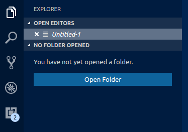
A set of colors for button widgets such as Open Folder button in the Explorer of a new window.
button.background: Button background color.button.foreground: Button foreground color.button.border: Button border color.button.separator: Button separator color.button.hoverBackground: Button background color when hovering.button.secondaryForeground: Secondary button foreground color.button.secondaryBackground: Secondary button background color.button.secondaryHoverBackground: Secondary button background color when hovering.button.secondaryBorder: Secondary button border color.checkbox.background: Background color of checkbox widget.checkbox.foreground: Foreground color of checkbox widget.checkbox.disabled.background: Background of a disabled checkbox.checkbox.disabled.foreground: Foreground of a disabled checkbox.checkbox.border: Border color of checkbox widget.checkbox.selectBackground: Background color of checkbox widget when the element it's in is selected.checkbox.selectBorder: Border color of checkbox widget when the element it's in is selected.radio.activeForeground: Foreground color of active radio option.radio.activeBackground: Background color of active radio option.radio.activeBorder: Border color of the active radio option.radio.inactiveForeground: Foreground color of inactive radio option.radio.inactiveBackground: Background color of inactive radio option.radio.inactiveBorder: Border color of the inactive radio option.radio.inactiveHoverBackground: Background color of inactive active radio option when hovering.
Dropdown control
A set of colors for all Dropdown widgets such as in the Integrated Terminal or the Output panel. Note that the Dropdown control is not used on macOS currently.

dropdown.background: Dropdown background.dropdown.listBackground: Dropdown list background.dropdown.border: Dropdown border.dropdown.foreground: Dropdown foreground.
Input control
Colors for input controls such as in the Search view or the Find/Replace dialog.

input.background: Input box background.input.border: Input box border.input.foreground: Input box foreground.input.placeholderForeground: Input box foreground color for placeholder text.inputOption.activeBackground: Background color of activated options in input fields.inputOption.activeBorder: Border color of activated options in input fields.inputOption.activeForeground: Foreground color of activated options in input fields.inputOption.hoverBackground: Background color of activated options in input fields.inputValidation.errorBackground: Input validation background color for error severity.inputValidation.errorForeground: Input validation foreground color for error severity.inputValidation.errorBorder: Input validation border color for error severity.inputValidation.infoBackground: Input validation background color for information severity.inputValidation.infoForeground: Input validation foreground color for information severity.inputValidation.infoBorder: Input validation border color for information severity.inputValidation.warningBackground: Input validation background color for information warning.inputValidation.warningForeground: Input validation foreground color for warning severity.inputValidation.warningBorder: Input validation border color for warning severity.
Scrollbar control
scrollbar.background: Scrollbar track background color.scrollbar.shadow: Scrollbar slider shadow to indicate that the view is scrolled.scrollbarSlider.activeBackground: Scrollbar slider background color when clicked on.scrollbarSlider.background: Scrollbar slider background color.scrollbarSlider.hoverBackground: Scrollbar slider background color when hovering.
Badge
Badges are small information labels, for example, search results count.
badge.foreground: Badge foreground color.badge.background: Badge background color.
Progress bar
progressBar.background: Background color of the progress bar shown for long running operations.
Lists and trees
Colors for list and trees like the File Explorer. An active list/tree has keyboard focus, an inactive does not.
list.activeSelectionBackground: List/Tree background color for the selected item when the list/tree is active.list.activeSelectionForeground: List/Tree foreground color for the selected item when the list/tree is active.list.activeSelectionIconForeground: List/Tree icon foreground color for the selected item when the list/tree is active. An active list/tree has keyboard focus, an inactive does not.list.dropBackground: List/Tree drag and drop background when moving items around using the mouse.list.focusBackground: List/Tree background color for the focused item when the list/tree is active.list.focusForeground: List/Tree foreground color for the focused item when the list/tree is active. An active list/tree has keyboard focus, an inactive does not.list.focusHighlightForeground: List/Tree foreground color of the match highlights on actively focused items when searching inside the list/tree.list.focusOutline: List/Tree outline color for the focused item when the list/tree is active. An active list/tree has keyboard focus, an inactive does not.list.focusAndSelectionOutline: List/Tree outline color for the focused item when the list/tree is active and selected. An active list/tree has keyboard focus, an inactive does not.list.highlightForeground: List/Tree foreground color of the match highlights when searching inside the list/tree.list.hoverBackground: List/Tree background when hovering over items using the mouse.list.hoverForeground: List/Tree foreground when hovering over items using the mouse.list.inactiveSelectionBackground: List/Tree background color for the selected item when the list/tree is inactive.list.inactiveSelectionForeground: List/Tree foreground color for the selected item when the list/tree is inactive. An active list/tree has keyboard focus, an inactive does not.list.inactiveSelectionIconForeground: List/Tree icon foreground color for the selected item when the list/tree is inactive. An active list/tree has keyboard focus, an inactive does not.list.inactiveFocusBackground: List background color for the focused item when the list is inactive. An active list has keyboard focus, an inactive does not. Currently only supported in lists.list.inactiveFocusOutline: List/Tree outline color for the focused item when the list/tree is inactive. An active list/tree has keyboard focus, an inactive does not.list.invalidItemForeground: List/Tree foreground color for invalid items, for example an unresolved root in explorer.list.errorForeground: Foreground color of list items containing errors.list.warningForeground: Foreground color of list items containing warnings.listFilterWidget.background: List/Tree Filter background color of typed text when searching inside the list/tree.listFilterWidget.outline: List/Tree Filter Widget's outline color of typed text when searching inside the list/tree.listFilterWidget.noMatchesOutline: List/Tree Filter Widget's outline color when no match is found of typed text when searching inside the list/tree.listFilterWidget.shadow: Shadow color of the type filter widget in lists and tree.list.filterMatchBackground: Background color of the filtered matches in lists and trees.list.filterMatchBorder: Border color of the filtered matches in lists and trees.list.deemphasizedForeground: List/Tree foreground color for items that are deemphasized.list.dropBetweenBackground: List/Tree drag and drop border color when moving items between items when using the mouse.tree.indentGuidesStroke: Tree Widget's stroke color for indent guides.tree.inactiveIndentGuidesStroke: Tree stroke color for the indentation guides that are not active.tree.tableColumnsBorder: Tree stroke color for the indentation guides.tree.tableOddRowsBackground: Background color for odd table rows.
Activity Bar
The Activity Bar is usually displayed either on the far left or right of the workbench and allows fast switching between views of the Side Bar.
activityBar.background: Activity Bar background color.activityBar.dropBorder: Drag and drop feedback color for the activity bar items. The activity bar is showing on the far left or right and allows to switch between views of the side bar.activityBar.foreground: Activity Bar foreground color (for example used for the icons).activityBar.inactiveForeground: Activity Bar item foreground color when it is inactive.activityBar.border: Activity Bar border color with the Side Bar.activityBarBadge.background: Activity notification badge background color.activityBarBadge.foreground: Activity notification badge foreground color.activityBar.activeBorder: Activity Bar active indicator border color.activityBar.activeBackground: Activity Bar optional background color for the active element.activityBar.activeFocusBorder: Activity bar focus border color for the active item.activityBarTop.foreground: Active foreground color of the item in the Activity bar when it is on top. The activity allows to switch between views of the side bar.activityBarTop.activeBorder: Focus border color for the active item in the Activity bar when it is on top. The activity allows to switch between views of the side bar.activityBarTop.inactiveForeground: Inactive foreground color of the item in the Activity bar when it is on top. The activity allows to switch between views of the side bar.activityBarTop.dropBorder: Drag and drop feedback color for the items in the Activity bar when it is on top. The activity allows to switch between views of the side bar.activityBarTop.background: Background color of the activity bar when set to top / bottom.activityBarTop.activeBackground: Background color for the active item in the Activity bar when it is on top / bottom. The activity allows to switch between views of the side bar.activityWarningBadge.foreground: Foreground color of the warning activity badgeactivityWarningBadge.background: Background color of the warning activity badgeactivityErrorBadge.foreground: Foreground color of the error activity badgeactivityErrorBadge.background: Background color of the error activity badge
Profiles
profileBadge.background: Profile badge background color. The profile badge shows on top of the settings gear icon in the activity bar.profileBadge.foreground: Profile badge foreground color. The profile badge shows on top of the settings gear icon in the activity bar.profiles.sashBorder: The color of the Profiles editor splitview sash border.
Side Bar
The Side Bar contains views like the Explorer and Search.
-
sideBar.background: Side Bar background color. -
sideBar.foreground: Side Bar foreground color. The Side Bar is the container for views like Explorer and Search. -
sideBar.border: Side Bar border color on the side separating the editor. -
sideBar.dropBackground: Drag and drop feedback color for the side bar sections. The color should have transparency so that the side bar sections can still shine through. -
sideBarTitle.foreground: Side Bar title foreground color. -
sideBarSectionHeader.background: Side Bar section header background color. -
sideBarSectionHeader.foreground: Side Bar section header foreground color. -
sideBarSectionHeader.border: Side bar section header border color. -
sideBarActivityBarTop.border: Border color between the activity bar at the top/bottom and the views. -
sideBarTitle.background: Side bar title background color. The side bar is the container for views like explorer and search. -
sideBarTitle.border: Side bar title border color on the bottom, separating the title from the views. The side bar is the container for views like explorer and search. -
sideBarStickyScroll.background: Background color of sticky scroll in the side bar. -
sideBarStickyScroll.border: Border color of sticky scroll in the side bar. -
sideBarStickyScroll.shadow: Shadow color of sticky scroll in the side bar.
Minimap
The Minimap shows a minified version of the current file.
-
minimap.findMatchHighlight: Highlight color for matches from search within files. -
minimap.selectionHighlight: Highlight color for the editor selection. -
minimap.errorHighlight: Highlight color for errors within the editor. -
minimap.warningHighlight: Highlight color for warnings within the editor. -
minimap.background: Minimap background color. -
minimap.selectionOccurrenceHighlight: Minimap marker color for repeating editor selections. -
minimap.foregroundOpacity: Opacity of foreground elements rendered in the minimap. For example, "#000000c0" will render the elements with 75% opacity. -
minimap.infoHighlight: Minimap marker color for infos. -
minimap.chatEditHighlight: Color of pending edit regions in the minimap. -
minimapSlider.background: Minimap slider background color. -
minimapSlider.hoverBackground: Minimap slider background color when hovering. -
minimapSlider.activeBackground: Minimap slider background color when clicked on. -
minimapGutter.addedBackground: Minimap gutter color for added content. -
minimapGutter.modifiedBackground: Minimap gutter color for modified content. -
minimapGutter.deletedBackground: Minimap gutter color for deleted content. -
editorMinimap.inlineChatInserted: Minimap marker color for inline chat inserted content.
Editor Groups & Tabs
Editor Groups are the containers of editors. There can be many editor groups. A Tab is the container of an editor. Multiple Tabs can be opened in one editor group.
-
editorGroup.border: Color to separate multiple editor groups from each other.
-
editorGroup.dropBackground: Background color when dragging editors around.
-
editorGroupHeader.noTabsBackground: Background color of the editor group title header when using single Tab (set"workbench.editor.showTabs": "single").
-
editorGroupHeader.tabsBackground: Background color of the Tabs container.
-
editorGroupHeader.tabsBorder: Border color below the editor tabs control when tabs are enabled.
-
editorGroupHeader.border: Border color between editor group header and editor (below breadcrumbs if enabled). -
editorGroup.emptyBackground: Background color of an empty editor group. -
editorGroup.focusedEmptyBorder: Border color of an empty editor group that is focused. -
editorGroup.dropIntoPromptForeground: Foreground color of text shown over editors when dragging files. This text informs the user that they can hold shift to drop into the editor. -
editorGroup.dropIntoPromptBackground: Background color of text shown over editors when dragging files. This text informs the user that they can hold shift to drop into the editor. -
editorGroup.dropIntoPromptBorder: Border color of text shown over editors when dragging files. This text informs the user that they can hold shift to drop into the editor. -
tab.activeBackground: Active Tab background color in an active group. -
tab.unfocusedActiveBackground: Active Tab background color in an inactive editor group. -
tab.activeForeground: Active Tab foreground color in an active group. -
tab.border: Border to separate Tabs from each other. -
tab.activeBorder: Bottom border for the active tab. -
tab.selectedBorderTop: Border to the top of a selected tab. Tabs are the containers for editors in the editor area. Multiple tabs can be opened in one editor group. There can be multiple editor groups. -
tab.selectedBackground: Background of a selected tab. Tabs are the containers for editors in the editor area. Multiple tabs can be opened in one editor group. There can be multiple editor groups. -
tab.selectedForeground: Foreground of a selected tab. Tabs are the containers for editors in the editor area. Multiple tabs can be opened in one editor group. There can be multiple editor groups. -
tab.dragAndDropBorder: Border between tabs to indicate that a tab can be inserted between two tabs. Tabs are the containers for editors in the editor area. Multiple tabs can be opened in one editor group. There can be multiple editor groups. -
tab.unfocusedActiveBorder: Bottom border for the active tab in an inactive editor group. -
tab.activeBorderTop: Top border for the active tab. -
tab.unfocusedActiveBorderTop: Top border for the active tab in an inactive editor group -
tab.lastPinnedBorder: Border on the right of the last pinned editor to separate from unpinned editors. -
tab.inactiveBackground: Inactive Tab background color. -
tab.unfocusedInactiveBackground: Inactive Tab background color in an unfocused group -
tab.inactiveForeground: Inactive Tab foreground color in an active group. -
tab.unfocusedActiveForeground: Active tab foreground color in an inactive editor group. -
tab.unfocusedInactiveForeground: Inactive tab foreground color in an inactive editor group. -
tab.hoverBackground: Tab background color when hovering -
tab.unfocusedHoverBackground: Tab background color in an unfocused group when hovering -
tab.hoverForeground: Tab foreground color when hovering -
tab.unfocusedHoverForeground: Tab foreground color in an unfocused group when hovering -
tab.hoverBorder: Border to highlight tabs when hovering -
tab.unfocusedHoverBorder: Border to highlight tabs in an unfocused group when hovering -
tab.activeModifiedBorder: Border on the top of modified (dirty) active tabs in an active group. -
tab.inactiveModifiedBorder: Border on the top of modified (dirty) inactive tabs in an active group. -
tab.unfocusedActiveModifiedBorder: Border on the top of modified (dirty) active tabs in an unfocused group. -
tab.unfocusedInactiveModifiedBorder: Border on the top of modified (dirty) inactive tabs in an unfocused group. -
editorPane.background: Background color of the editor pane visible on the left and right side of the centered editor layout. -
sideBySideEditor.horizontalBorder: Color to separate two editors from each other when shown side by side in an editor group from top to bottom. -
sideBySideEditor.verticalBorder: Color to separate two editors from each other when shown side by side in an editor group from left to right.
Editor colors
The most prominent editor colors are the token colors used for syntax highlighting and are based on the language grammar installed. These colors are defined by the Color Theme but can also be customized with the editor.tokenColorCustomizations setting. See Customize a Color Theme for details on updating a Color Theme and the available token types.
All other editor colors are listed here:
editor.background: Editor background color.editor.foreground: Editor default foreground color.editorLineNumber.foreground: Color of editor line numbers.editorLineNumber.activeForeground: Color of the active editor line number.editorLineNumber.dimmedForeground: Color of the final editor line when editor.renderFinalNewline is set to dimmed.editorCursor.background: The background color of the editor cursor. Allows customizing the color of a character overlapped by a block cursor.editorCursor.foreground: Color of the editor cursor.editorMultiCursor.primary.foreground: Color of the primary editor cursor when multiple cursors are present.editorMultiCursor.primary.background: The background color of the primary editor cursor when multiple cursors are present. Allows customizing the color of a character overlapped by a block cursor.editorMultiCursor.secondary.foreground: Color of secondary editor cursors when multiple cursors are present.editorMultiCursor.secondary.background: The background color of secondary editor cursors when multiple cursors are present. Allows customizing the color of a character overlapped by a block cursor.editor.placeholder.foreground: Foreground color of the placeholder text in the editor.editor.compositionBorder: The border color for an IME composition.
Selection colors are visible when selecting one or more characters. In addition to the selection also all regions with the same content are highlighted.

editor.selectionBackground: Color of the editor selection.editor.selectionForeground: Color of the selected text for high contrast.editor.inactiveSelectionBackground: Color of the selection in an inactive editor. The color must not be opaque so as not to hide underlying decorations.editor.selectionHighlightBackground: Color for regions with the same content as the selection. The color must not be opaque so as not to hide underlying decorations.editor.selectionHighlightBorder: Border color for regions with the same content as the selection.
Word highlight colors are visible when the cursor is inside a symbol or a word. Depending on the language support available for the file type, all matching references and declarations are highlighted and read and write accesses get different colors. If document symbol language support is not available, this falls back to word highlighting.

editor.wordHighlightBackground: Background color of a symbol during read-access, for example when reading a variable. The color must not be opaque so as not to hide underlying decorations.editor.wordHighlightBorder: Border color of a symbol during read-access, for example when reading a variable.editor.wordHighlightStrongBackground: Background color of a symbol during write-access, for example when writing to a variable. The color must not be opaque so as not to hide underlying decorations.editor.wordHighlightStrongBorder: Border color of a symbol during write-access, for example when writing to a variable.editor.wordHighlightTextBackground: Background color of a textual occurrence for a symbol. The color must not be opaque so as not to hide underlying decorations.editor.wordHighlightTextBorder: Border color of a textual occurrence for a symbol.
Find colors depend on the current find string in the Find/Replace dialog.
editor.findMatchBackground: Color of the current search match.editor.findMatchForeground: Text color of the current search match.editor.findMatchHighlightForeground: Foreground color of the other search matches.editor.findMatchHighlightBackground: Color of the other search matches. The color must not be opaque so as not to hide underlying decorations.editor.findRangeHighlightBackground: Color the range limiting the search (Enable 'Find in Selection' in the find widget). The color must not be opaque so as not to hide underlying decorations.editor.findMatchBorder: Border color of the current search match.editor.findMatchHighlightBorder: Border color of the other search matches.editor.findRangeHighlightBorder: Border color the range limiting the search (Enable 'Find in Selection' in the find widget).
Search colors are used in the search viewlet's global search results.

search.resultsInfoForeground: Color of the text in the search viewlet's completion message. For example, this color is used in the text that says "{x} results in {y} files".
Search Editor colors highlight results in a Search Editor. This can be configured separately from other find matches in order to better differentiate between different classes of match in the same editor.

searchEditor.findMatchBackground: Color of the editor's results.searchEditor.findMatchBorder: Border color of the editor's results.searchEditor.textInputBorder: Search editor text input box border.
The hover highlight is shown behind the symbol for which a hover is shown.

editor.hoverHighlightBackground: Highlight below the word for which a hover is shown. The color must not be opaque so as not to hide underlying decorations.
The current line is typically shown as either background highlight or a border (not both).

editor.lineHighlightBackground: Background color for the highlight of line at the cursor position.editor.inactiveLineHighlightBackground: Background color for the highlight of line at the cursor position when the editor is not focused.editor.lineHighlightBorder: Background color for the border around the line at the cursor position.
The color for unicode highlights
editorUnicodeHighlight.border: Border color used to highlight unicode characters.editorUnicodeHighlight.background: Background color used to highlight unicode characters.
The link color is visible when clicking on a link.

editorLink.activeForeground: Color of active links.
The range highlight is visible when selecting a search result.

editor.rangeHighlightBackground: Background color of highlighted ranges, used by Quick Open, Symbol in File and Find features. The color must not be opaque so as not to hide underlying decorations.editor.rangeHighlightBorder: Background color of the border around highlighted ranges.
The symbol highlight is visible when navigating to a symbol via a command such as Go to Definition.
editor.symbolHighlightBackground: Background color of highlighted symbol. The color must not be opaque so as not to hide underlying decorations.editor.symbolHighlightBorder: Background color of the border around highlighted symbols.
To see the editor white spaces, enable Toggle Render Whitespace.
editorWhitespace.foreground: Color of whitespace characters in the editor.
To see the editor indent guides, set "editor.guides.indentation": true and "editor.guides.highlightActiveIndentation": true.
editorIndentGuide.background: Color of the editor indentation guides.editorIndentGuide.background1: Color of the editor indentation guides (1).editorIndentGuide.background2: Color of the editor indentation guides (2).editorIndentGuide.background3: Color of the editor indentation guides (3).editorIndentGuide.background4: Color of the editor indentation guides (4).editorIndentGuide.background5: Color of the editor indentation guides (5).editorIndentGuide.background6: Color of the editor indentation guides (6).editorIndentGuide.activeBackground: Color of the active editor indentation guide.editorIndentGuide.activeBackground1: Color of the active editor indentation guides (1).editorIndentGuide.activeBackground2: Color of the active editor indentation guides (2).editorIndentGuide.activeBackground3: Color of the active editor indentation guides (3).editorIndentGuide.activeBackground4: Color of the active editor indentation guides (4).editorIndentGuide.activeBackground5: Color of the active editor indentation guides (5).editorIndentGuide.activeBackground6: Color of the active editor indentation guides (6).
To see the editor inline hints, set "editor.inlineSuggest.enabled": true.
editorInlayHint.background: Background color of inline hints.editorInlayHint.foreground: Foreground color of inline hints.editorInlayHint.typeForeground: Foreground color of inline hints for typeseditorInlayHint.typeBackground: Background color of inline hints for typeseditorInlayHint.parameterForeground: Foreground color of inline hints for parameterseditorInlayHint.parameterBackground: Background color of inline hints for parameters
To see editor rulers, define their location with "editor.rulers"
-
editorRuler.foreground: Color of the editor rulers. -
editor.linkedEditingBackground: Background color when the editor is in linked editing mode.
CodeLens:

editorCodeLens.foreground: Foreground color of an editor CodeLens.
Lightbulb:
editorLightBulb.foreground: The color used for the lightbulb actions icon.editorLightBulbAutoFix.foreground: The color used for the lightbulb auto fix actions icon.editorLightBulbAi.foreground: The color used for the lightbulb AI icon.
Bracket matches:

editorBracketMatch.background: Background color behind matching brackets.editorBracketMatch.border: Color for matching brackets boxes.editorBracketMatch.foreground: Foreground color for matching brackets.
Bracket pair colorization:
editorBracketHighlight.foreground1: Foreground color of brackets (1). Requires enabling bracket pair colorization.editorBracketHighlight.foreground2: Foreground color of brackets (2). Requires enabling bracket pair colorization.editorBracketHighlight.foreground3: Foreground color of brackets (3). Requires enabling bracket pair colorization.editorBracketHighlight.foreground4: Foreground color of brackets (4). Requires enabling bracket pair colorization.editorBracketHighlight.foreground5: Foreground color of brackets (5). Requires enabling bracket pair colorization.editorBracketHighlight.foreground6: Foreground color of brackets (6). Requires enabling bracket pair colorization.editorBracketHighlight.unexpectedBracket.foreground: Foreground color of unexpected brackets.
Bracket pair guides:
-
editorBracketPairGuide.activeBackground1: Background color of active bracket pair guides (1). Requires enabling bracket pair guides. -
editorBracketPairGuide.activeBackground2: Background color of active bracket pair guides (2). Requires enabling bracket pair guides. -
editorBracketPairGuide.activeBackground3: Background color of active bracket pair guides (3). Requires enabling bracket pair guides. -
editorBracketPairGuide.activeBackground4: Background color of active bracket pair guides (4). Requires enabling bracket pair guides. -
editorBracketPairGuide.activeBackground5: Background color of active bracket pair guides (5). Requires enabling bracket pair guides. -
editorBracketPairGuide.activeBackground6: Background color of active bracket pair guides (6). Requires enabling bracket pair guides. -
editorBracketPairGuide.background1: Background color of inactive bracket pair guides (1). Requires enabling bracket pair guides. -
editorBracketPairGuide.background2: Background color of inactive bracket pair guides (2). Requires enabling bracket pair guides. -
editorBracketPairGuide.background3: Background color of inactive bracket pair guides (3). Requires enabling bracket pair guides. -
editorBracketPairGuide.background4: Background color of inactive bracket pair guides (4). Requires enabling bracket pair guides. -
editorBracketPairGuide.background5: Background color of inactive bracket pair guides (5). Requires enabling bracket pair guides. -
editorBracketPairGuide.background6: Background color of inactive bracket pair guides (6). Requires enabling bracket pair guides.
Folding:
editor.foldBackground: Background color for folded ranges. The color must not be opaque so as not to hide underlying decorations.editor.foldPlaceholderForeground: Color of the collapsed text after the first line of a folded range.
Overview ruler:
This ruler is located beneath the scroll bar on the right edge of the editor and gives an overview of the decorations in the editor.
editorOverviewRuler.background: Background color of the editor overview ruler. Only used when the minimap is enabled and placed on the right side of the editor.editorOverviewRuler.border: Color of the overview ruler border.editorOverviewRuler.findMatchForeground: Overview ruler marker color for find matches. The color must not be opaque so as not to hide underlying decorations.editorOverviewRuler.rangeHighlightForeground: Overview ruler marker color for highlighted ranges, like by the Quick Open, Symbol in File and Find features. The color must not be opaque so as not to hide underlying decorations.editorOverviewRuler.selectionHighlightForeground: Overview ruler marker color for selection highlights. The color must not be opaque so as not to hide underlying decorations.editorOverviewRuler.wordHighlightForeground: Overview ruler marker color for symbol highlights. The color must not be opaque so as not to hide underlying decorations.editorOverviewRuler.wordHighlightStrongForeground: Overview ruler marker color for write-access symbol highlights. The color must not be opaque so as not to hide underlying decorations.editorOverviewRuler.wordHighlightTextForeground: Overview ruler marker color of a textual occurrence for a symbol. The color must not be opaque so as not to hide underlying decorations.editorOverviewRuler.modifiedForeground: Overview ruler marker color for modified content.editorOverviewRuler.addedForeground: Overview ruler marker color for added content.editorOverviewRuler.deletedForeground: Overview ruler marker color for deleted content.editorOverviewRuler.errorForeground: Overview ruler marker color for errors.editorOverviewRuler.warningForeground: Overview ruler marker color for warnings.editorOverviewRuler.infoForeground: Overview ruler marker color for infos.editorOverviewRuler.bracketMatchForeground: Overview ruler marker color for matching brackets.editorOverviewRuler.inlineChatInserted: Overview ruler marker color for inline chat inserted content.editorOverviewRuler.inlineChatRemoved: Overview ruler marker color for inline chat removed content.editorOverviewRuler.commentDraftForeground: Editor overview ruler decoration color for comment threads with draft comments. This color should be opaque.
Errors and warnings:
editorError.foreground: Foreground color of error squiggles in the editor.editorError.border: Border color of error boxes in the editor.editorError.background: Background color of error text in the editor. The color must not be opaque so as not to hide underlying decorations.editorWarning.foreground: Foreground color of warning squiggles in the editor.editorWarning.border: Border color of warning boxes in the editor.editorWarning.background: Background color of warning text in the editor. The color must not be opaque so as not to hide underlying decorations.editorInfo.foreground: Foreground color of info squiggles in the editor.editorInfo.border: Border color of info boxes in the editor.editorInfo.background: Background color of info text in the editor. The color must not be opaque so as not to hide underlying decorations.editorHint.foreground: Foreground color of hints in the editor.editorHint.border: Border color of hint boxes in the editor.problemsErrorIcon.foreground: The color used for the problems error icon.problemsWarningIcon.foreground: The color used for the problems warning icon.problemsInfoIcon.foreground: The color used for the problems info icon.
Unused source code:
editorUnnecessaryCode.border: Border color of unnecessary (unused) source code in the editor.editorUnnecessaryCode.opacity: Opacity of unnecessary (unused) source code in the editor. For example,"#000000c0"will render the code with 75% opacity. For high contrast themes, use the"editorUnnecessaryCode.border"theme color to underline unnecessary code instead of fading it out.
The gutter contains the glyph margins and the line numbers:
editorGutter.background: Background color of the editor gutter. The gutter contains the glyph margins and the line numbers.editorGutter.modifiedBackground: Editor gutter background color for lines that are modified.editorGutter.modifiedSecondaryBackground: Editor gutter secondary background color for lines that are modified.editorGutter.addedBackground: Editor gutter background color for lines that are added.editorGutter.addedSecondaryBackground: Editor gutter secondary background color for lines that are added.editorGutter.deletedBackground: Editor gutter background color for lines that are deleted.editorGutter.deletedSecondaryBackground: Editor gutter secondary background color for lines that are deleted.editorGutter.commentRangeForeground: Editor gutter decoration color for commenting ranges.editorGutter.commentGlyphForeground: Editor gutter decoration color for commenting glyphs.editorGutter.commentUnresolvedGlyphForeground: Editor gutter decoration color for commenting glyphs for unresolved comment threads.editorGutter.foldingControlForeground: Color of the folding control in the editor gutter.editorGutter.itemGlyphForeground: Editor gutter decoration color for gutter item glyphs.editorGutter.itemBackground: Editor gutter decoration color for gutter item background. This color should be opaque.editorGutter.commentDraftGlyphForeground: Editor gutter decoration color for commenting glyphs for comment threads with draft comments.
The editor comments widget can be seen when reviewing pull requests:
editorCommentsWidget.resolvedBorder: Color of borders and arrow for resolved comments.editorCommentsWidget.unresolvedBorder: Color of borders and arrow for unresolved comments.editorCommentsWidget.rangeBackground: Color of background for comment ranges.editorCommentsWidget.rangeActiveBackground: Color of background for currently selected or hovered comment range.editorCommentsWidget.replyInputBackground: Background color for comment reply input box.
Editor inline edits can be seen when using Copilot to suggest the next change to make:
inlineEdit.gutterIndicator.primaryBorder: Border color for the primary inline edit gutter indicator.inlineEdit.gutterIndicator.primaryForeground: Foreground color for the primary inline edit gutter indicator.inlineEdit.gutterIndicator.primaryBackground: Background color for the primary inline edit gutter indicator.inlineEdit.gutterIndicator.secondaryBorder: Border color for the secondary inline edit gutter indicator.inlineEdit.gutterIndicator.secondaryForeground: Foreground color for the secondary inline edit gutter indicator.inlineEdit.gutterIndicator.secondaryBackground: Background color for the secondary inline edit gutter indicator.inlineEdit.gutterIndicator.successfulBorder: Border color for the successful inline edit gutter indicator.inlineEdit.gutterIndicator.successfulForeground: Foreground color for the successful inline edit gutter indicator.inlineEdit.gutterIndicator.successfulBackground: Background color for the successful inline edit gutter indicator.inlineEdit.gutterIndicator.background: Background color for the inline edit gutter indicator.inlineEdit.originalBackground: Background color for the original text in inline edits.inlineEdit.modifiedBackground: Background color for the modified text in inline edits.inlineEdit.originalChangedLineBackground: Background color for the changed lines in the original text of inline edits.inlineEdit.originalChangedTextBackground: Overlay color for the changed text in the original text of inline edits.inlineEdit.modifiedChangedLineBackground: Background color for the changed lines in the modified text of inline edits.inlineEdit.modifiedChangedTextBackground: Overlay color for the changed text in the modified text of inline edits.inlineEdit.originalBorder: Border color for the original text in inline edits.inlineEdit.modifiedBorder: Border color for the modified text in inline edits.inlineEdit.tabWillAcceptModifiedBorder: Modified border color for the inline edits widget when tab will accept it.inlineEdit.tabWillAcceptOriginalBorder: Original border color for the inline edits widget over the original text when tab will accept it.
Diff editor colors
For coloring inserted and removed text, use either a background or a border color but not both.
diffEditor.insertedTextBackground: Background color for text that got inserted. The color must not be opaque so as not to hide underlying decorations.diffEditor.insertedTextBorder: Outline color for the text that got inserted.diffEditor.removedTextBackground: Background color for text that got removed. The color must not be opaque so as not to hide underlying decorations.diffEditor.removedTextBorder: Outline color for text that got removed.diffEditor.border: Border color between the two text editors.diffEditor.diagonalFill: Color of the diff editor's diagonal fill. The diagonal fill is used in side-by-side diff views.diffEditor.insertedLineBackground: Background color for lines that got inserted. The color must not be opaque so as not to hide underlying decorations.diffEditor.removedLineBackground: Background color for lines that got removed. The color must not be opaque so as not to hide underlying decorations.diffEditorGutter.insertedLineBackground: Background color for the margin where lines got inserted.diffEditorGutter.removedLineBackground: Background color for the margin where lines got removed.diffEditorOverview.insertedForeground: Diff overview ruler foreground for inserted content.diffEditorOverview.removedForeground: Diff overview ruler foreground for removed content.diffEditor.unchangedRegionBackground: The color of unchanged blocks in diff editor.diffEditor.unchangedRegionForeground: The foreground color of unchanged blocks in the diff editor.diffEditor.unchangedRegionShadow: The color of the shadow around unchanged region widgets.diffEditor.unchangedCodeBackground: The background color of unchanged code in the diff editor.diffEditor.move.border: The border color for text that got moved in the diff editor.diffEditor.moveActive.border: The active border color for text that got moved in the diff editor.multiDiffEditor.headerBackground: The background color of the diff editor's headermultiDiffEditor.background: The background color of the multi file diff editormultiDiffEditor.border: The border color of the multi file diff editor
Chat colors
chat.requestBorder: The border color of a chat request.chat.requestBackground: The background color of a chat request.chat.slashCommandBackground: The background color of a chat slash command.chat.slashCommandForeground: The foreground color of a chat slash command.chat.avatarBackground: The background color of a chat avatar.chat.avatarForeground: The foreground color of a chat avatar.chat.editedFileForeground: The foreground color of a chat edited file in the edited file list.chat.linesAddedForeground: Foreground color of lines added in chat code block pill.chat.linesRemovedForeground: Foreground color of lines removed in chat code block pill.chat.requestCodeBorder: Border color of code blocks within the chat request bubble.chat.requestBubbleBackground: Background color of the chat request bubble.chat.requestBubbleHoverBackground: Background color of the chat request bubble on hover.chat.checkpointSeparator: Chat checkpoint separator color.chat.thinkingShimmer: Shimmer highlight for thinking/working labels.chatManagement.sashBorder: The color of the Chat Management editor splitview sash border.
Inline Chat colors
inlineChat.background: Background color of the interactive editor widget.inlineChat.foreground: Foreground color of the interactive editor widgetinlineChat.border: Border color of the interactive editor widget.inlineChat.shadow: Shadow color of the interactive editor widget.inlineChatInput.border: Border color of the interactive editor input.inlineChatInput.focusBorder: Border color of the interactive editor input when focused.inlineChatInput.placeholderForeground: Foreground color of the interactive editor input placeholder.inlineChatInput.background: Background color of the interactive editor input.inlineChatDiff.inserted: Background color of inserted text in the interactive editor input.inlineChatDiff.removed: Background color of removed text in the interactive editor input.
Panel Chat colors
interactive.activeCodeBorder: The border color for the current interactive code cell when the editor has focus.interactive.inactiveCodeBorder: The border color for the current interactive code cell when the editor does not have focus.
Editor widget colors
The Editor widget is shown in front of the editor content. Examples are the Find/Replace dialog, the suggestion widget, and the editor hover.
-
editorWidget.foreground: Foreground color of editor widgets, such as find/replace. -
editorWidget.background: Background color of editor widgets, such as Find/Replace. -
editorWidget.border: Border color of the editor widget unless the widget does not contain a border or defines its own border color. -
editorWidget.resizeBorder: Border color of the resize bar of editor widgets. The color is only used if the widget chooses to have a resize border and if the color is not overridden by a widget. -
editorSuggestWidget.background: Background color of the suggestion widget. -
editorSuggestWidget.border: Border color of the suggestion widget. -
editorSuggestWidget.foreground: Foreground color of the suggestion widget. -
editorSuggestWidget.focusHighlightForeground: Color of the match highlights in the suggest widget when an item is focused. -
editorSuggestWidget.highlightForeground: Color of the match highlights in the suggestion widget. -
editorSuggestWidget.selectedBackground: Background color of the selected entry in the suggestion widget. -
editorSuggestWidget.selectedForeground: Foreground color of the selected entry in the suggest widget. -
editorSuggestWidget.selectedIconForeground: Icon foreground color of the selected entry in the suggest widget. -
editorSuggestWidgetStatus.foreground: Foreground color of the suggest widget status. -
editorHoverWidget.foreground: Foreground color of the editor hover. -
editorHoverWidget.background: Background color of the editor hover. -
editorHoverWidget.border: Border color of the editor hover. -
editorHoverWidget.highlightForeground: Foreground color of the active item in the parameter hint. -
editorHoverWidget.statusBarBackground: Background color of the editor hover status bar. -
editorGhostText.border: Border color of the ghost text shown by inline completion providers and the suggest preview. -
editorGhostText.background: Background color of the ghost text in the editor. -
editorGhostText.foreground: Foreground color of the ghost text shown by inline completion providers and the suggest preview. -
editorStickyScroll.background: Editor sticky scroll background color. -
editorStickyScroll.border: Border color of sticky scroll in the editor. -
editorStickyScroll.shadow: Shadow color of sticky scroll in the editor. -
editorStickyScrollGutter.background: Background color of the gutter part of sticky scroll in the editor. -
editorStickyScrollHover.background: Editor sticky scroll on hover background color.
The Debug Exception widget is a peek view that shows in the editor when debug stops at an exception.
debugExceptionWidget.background: Exception widget background color.debugExceptionWidget.border: Exception widget border color.
The editor marker view shows when navigating to errors and warnings in the editor (Go to Next Error or Warning command).
editorMarkerNavigation.background: Editor marker navigation widget background.editorMarkerNavigationError.background: Editor marker navigation widget error color.editorMarkerNavigationWarning.background: Editor marker navigation widget warning color.editorMarkerNavigationInfo.background: Editor marker navigation widget info color.editorMarkerNavigationError.headerBackground: Editor marker navigation widget error heading background.editorMarkerNavigationWarning.headerBackground: Editor marker navigation widget warning heading background.editorMarkerNavigationInfo.headerBackground: Editor marker navigation widget info heading background.
Peek view colors
Peek views are used to show references and declarations as a view inside the editor.

peekView.border: Color of the peek view borders and arrow.peekViewEditor.background: Background color of the peek view editor.peekViewEditorGutter.background: Background color of the gutter in the peek view editor.peekViewEditor.matchHighlightBackground: Match highlight color in the peek view editor.peekViewEditor.matchHighlightBorder: Match highlight border color in the peek view editor.peekViewResult.background: Background color of the peek view result list.peekViewResult.fileForeground: Foreground color for file nodes in the peek view result list.peekViewResult.lineForeground: Foreground color for line nodes in the peek view result list.peekViewResult.matchHighlightBackground: Match highlight color in the peek view result list.peekViewResult.selectionBackground: Background color of the selected entry in the peek view result list.peekViewResult.selectionForeground: Foreground color of the selected entry in the peek view result list.peekViewTitle.background: Background color of the peek view title area.peekViewTitleDescription.foreground: Color of the peek view title info.peekViewTitleLabel.foreground: Color of the peek view title.peekViewEditorStickyScroll.background: Background color of sticky scroll in the peek view editor.peekViewEditorStickyScrollGutter.background: Background color of the gutter part of sticky scroll in the peek view editor.
Merge conflicts colors
Merge conflict decorations are shown when the editor contains special diff ranges.

merge.currentHeaderBackground: Current header background in inline merge conflicts. The color must not be opaque so as not to hide underlying decorations.merge.currentContentBackground: Current content background in inline merge conflicts. The color must not be opaque so as not to hide underlying decorations.merge.incomingHeaderBackground: Incoming header background in inline merge conflicts. The color must not be opaque so as not to hide underlying decorations.merge.incomingContentBackground: Incoming content background in inline merge conflicts. The color must not be opaque so as not to hide underlying decorations.merge.border: Border color on headers and the splitter in inline merge conflicts.merge.commonContentBackground: Common ancestor content background in inline merge-conflicts. The color must not be opaque so as not to hide underlying decorations.merge.commonHeaderBackground: Common ancestor header background in inline merge-conflicts. The color must not be opaque so as not to hide underlying decorations.editorOverviewRuler.currentContentForeground: Current overview ruler foreground for inline merge conflicts.editorOverviewRuler.incomingContentForeground: Incoming overview ruler foreground for inline merge conflicts.editorOverviewRuler.commonContentForeground: Common ancestor overview ruler foreground for inline merge conflicts.editorOverviewRuler.commentForeground: Editor overview ruler decoration color for resolved comments. This color should be opaque.editorOverviewRuler.commentUnresolvedForeground: Editor overview ruler decoration color for unresolved comments. This color should be opaque.mergeEditor.change.background: The background color for changes.mergeEditor.change.word.background: The background color for word changes.mergeEditor.conflict.unhandledUnfocused.border: The border color of unhandled unfocused conflicts.mergeEditor.conflict.unhandledFocused.border: The border color of unhandled focused conflicts.mergeEditor.conflict.handledUnfocused.border: The border color of handled unfocused conflicts.mergeEditor.conflict.handledFocused.border: The border color of handled focused conflicts.mergeEditor.conflict.handled.minimapOverViewRuler: The foreground color for changes in input 1.mergeEditor.conflict.unhandled.minimapOverViewRuler: The foreground color for changes in input 1.mergeEditor.conflictingLines.background: The background of the "Conflicting Lines" text.mergeEditor.changeBase.background: The background color for changes in base.mergeEditor.changeBase.word.background: The background color for word changes in base.mergeEditor.conflict.input1.background: The background color of decorations in input 1.mergeEditor.conflict.input2.background: The background color of decorations in input 2.
Panel colors
Panels are shown below the editor area and contain views like Output and Integrated Terminal.
panel.background: Panel background color.panel.border: Panel border color to separate the panel from the editor.panel.dropBorder: Drag and drop feedback color for the panel titles. Panels are shown below the editor area and contain views like output and integrated terminal.panelTitle.activeBorder: Border color for the active panel title.panelTitle.activeForeground: Title color for the active panel.panelTitle.inactiveForeground: Title color for the inactive panel.panelTitle.border: Panel title border color on the bottom, separating the title from the views. Panels are shown below the editor area and contain views like output and integrated terminal.panelTitleBadge.background: Panel title badge background color. Panels are shown below the editor area and contain views like output and integrated terminal.panelTitleBadge.foreground: Panel title badge foreground color. Panels are shown below the editor area and contain views like output and integrated terminal.panelInput.border: Input box border for inputs in the panel.panelSection.border: Panel section border color used when multiple views are stacked horizontally in the panel. Panels are shown below the editor area and contain views like output and integrated terminal.panelSection.dropBackground: Drag and drop feedback color for the panel sections. The color should have transparency so that the panel sections can still shine through. Panels are shown below the editor area and contain views like output and integrated terminal.panelSectionHeader.background: Panel section header background color. Panels are shown below the editor area and contain views like output and integrated terminal.panelSectionHeader.foreground: Panel section header foreground color. Panels are shown below the editor area and contain views like output and integrated terminal.panelStickyScroll.background: Background color of sticky scroll in the panel.panelStickyScroll.border: Border color of sticky scroll in the panel.panelStickyScroll.shadow: Shadow color of sticky scroll in the panel.panelSectionHeader.border: Panel section header border color used when multiple views are stacked vertically in the panel. Panels are shown below the editor area and contain views like output and integrated terminal.outputView.background: Output view background color.outputViewStickyScroll.background: Output view sticky scroll background color.
Status Bar colors
The Status Bar is shown in the bottom of the workbench.
statusBar.background: Standard Status Bar background color.statusBar.foreground: Status Bar foreground color.statusBar.border: Status Bar border color separating the Status Bar and editor.statusBar.debuggingBackground: Status Bar background color when a program is being debugged.statusBar.debuggingForeground: Status Bar foreground color when a program is being debugged.statusBar.debuggingBorder: Status Bar border color separating the Status Bar and editor when a program is being debugged.statusBar.noFolderForeground: Status Bar foreground color when no folder is opened.statusBar.noFolderBackground: Status Bar background color when no folder is opened.statusBar.noFolderBorder: Status Bar border color separating the Status Bar and editor when no folder is opened.statusBarItem.activeBackground: Status Bar item background color when clicking.statusBarItem.hoverForeground: Status bar item foreground color when hovering. The status bar is shown in the bottom of the window.statusBarItem.hoverBackground: Status Bar item background color when hovering.statusBarItem.prominentForeground: Status Bar prominent items foreground color.statusBarItem.prominentBackground: Status Bar prominent items background color.statusBarItem.prominentHoverForeground: Status bar prominent items foreground color when hovering. Prominent items stand out from other status bar entries to indicate importance. The status bar is shown in the bottom of the window.statusBarItem.prominentHoverBackground: Status Bar prominent items background color when hovering.statusBarItem.remoteBackground: Background color for the remote indicator on the status bar.statusBarItem.remoteForeground: Foreground color for the remote indicator on the status bar.statusBarItem.remoteHoverBackground: Background color for the remote indicator on the status bar when hovering.statusBarItem.remoteHoverForeground: Foreground color for the remote indicator on the status bar when hovering.statusBarItem.errorBackground: Status bar error items background color. Error items stand out from other status bar entries to indicate error conditions.statusBarItem.errorForeground: Status bar error items foreground color. Error items stand out from other status bar entries to indicate error conditions.statusBarItem.errorHoverBackground: Status bar error items background color when hovering. Error items stand out from other status bar entries to indicate error conditions. The status bar is shown in the bottom of the window.statusBarItem.errorHoverForeground: Status bar error items foreground color when hovering. Error items stand out from other status bar entries to indicate error conditions. The status bar is shown in the bottom of the window.statusBarItem.warningBackground: Status bar warning items background color. Warning items stand out from other status bar entries to indicate warning conditions. The status bar is shown in the bottom of the window.statusBarItem.warningForeground: Status bar warning items foreground color. Warning items stand out from other status bar entries to indicate warning conditions. The status bar is shown in the bottom of the window.statusBarItem.warningHoverBackground: Status bar warning items background color when hovering. Warning items stand out from other status bar entries to indicate warning conditions. The status bar is shown in the bottom of the window.statusBarItem.warningHoverForeground: Status bar warning items foreground color when hovering. Warning items stand out from other status bar entries to indicate warning conditions. The status bar is shown in the bottom of the window.statusBarItem.compactHoverBackground: Status bar item background color when hovering an item that contains two hovers. The status bar is shown in the bottom of the window.statusBarItem.focusBorder: Status bar item border color when focused on keyboard navigation. The status bar is shown in the bottom of the window.statusBar.focusBorder: Status bar border color when focused on keyboard navigation. The status bar is shown in the bottom of the window.statusBarItem.offlineBackground: Status bar item background color when the workbench is offline.statusBarItem.offlineForeground: Status bar item foreground color when the workbench is offline.statusBarItem.offlineHoverForeground: Status bar item foreground hover color when the workbench is offline.statusBarItem.offlineHoverBackground: Status bar item background hover color when the workbench is offline.
Prominent items stand out from other Status Bar entries to indicate importance. One example is the Toggle Tab Key Moves Focus command change mode indicator.
Title Bar colors
titleBar.activeBackground: Title Bar background when the window is active.titleBar.activeForeground: Title Bar foreground when the window is active.titleBar.inactiveBackground: Title Bar background when the window is inactive.titleBar.inactiveForeground: Title Bar foreground when the window is inactive.titleBar.border: Title bar border color.
Menu Bar colors
menubar.selectionForeground: Foreground color of the selected menu item in the menubar.menubar.selectionBackground: Background color of the selected menu item in the menubar.menubar.selectionBorder: Border color of the selected menu item in the menubar.menu.foreground: Foreground color of menu items.menu.background: Background color of menu items.menu.selectionForeground: Foreground color of the selected menu item in menus.menu.selectionBackground: Background color of the selected menu item in menus.menu.selectionBorder: Border color of the selected menu item in menus.menu.separatorBackground: Color of a separator menu item in menus.menu.border: Border color of menus.
Command Center colors
commandCenter.foreground: Foreground color of the Command Center.commandCenter.activeForeground: Active foreground color of the Command Center.commandCenter.background: Background color of the Command Center.commandCenter.activeBackground: Active background color of the Command Center.commandCenter.border: Border color of the Command Center.commandCenter.inactiveForeground: Foreground color of the Command Center when the window is inactive.commandCenter.inactiveBorder: Border color of the Command Center when the window is inactive.commandCenter.activeBorder: Active border color of the Command Center.commandCenter.debuggingBackground: Command Center background color when a program is being debugged.
Notification colors
Notification toasts slide up from the bottom-right of the workbench.

Once opened in the Notification Center, they are displayed in a list with a header:

notificationCenter.border: Notification Center border color.notificationCenterHeader.foreground: Notification Center header foreground color.notificationCenterHeader.background: Notification Center header background color.notificationToast.border: Notification toast border color.notifications.foreground: Notification foreground color.notifications.background: Notification background color.notifications.border: Notification border color separating from other notifications in the Notification Center.notificationLink.foreground: Notification links foreground color.notificationsErrorIcon.foreground: The color used for the notification error icon.notificationsWarningIcon.foreground: The color used for the notification warning icon.notificationsInfoIcon.foreground: The color used for the notification info icon.
Banner colors
The banner appears below the title bar and spans the entire width of the workbench when visible.
banner.background: Banner background color.banner.foreground: Banner foreground color.banner.iconForeground: Color for the icon in front of the banner text.
Extensions colors
extensionButton.prominentForeground: Extension view button foreground color (for example Install button).extensionButton.prominentBackground: Extension view button background color.extensionButton.prominentHoverBackground: Extension view button background hover color.extensionButton.background: Button background color for extension actions.extensionButton.foreground: Button foreground color for extension actions.extensionButton.hoverBackground: Button background hover color for extension actions.extensionButton.separator: Button separator color for extension actions.extensionButton.border: Button border color for extension actions.extensionBadge.remoteBackground: Background color for the remote badge in the extensions view.extensionBadge.remoteForeground: Foreground color for the remote badge in the extensions view.extensionIcon.starForeground: The icon color for extension ratings.extensionIcon.verifiedForeground: The icon color for extension verified publisher.extensionIcon.preReleaseForeground: The icon color for pre-release extension.extensionIcon.sponsorForeground: The icon color for extension sponsor.extensionIcon.privateForeground: The icon color for private extensions.mcpIcon.starForeground: The icon color for mcp starred.
Quick picker colors
pickerGroup.border: Quick picker (Quick Open) color for grouping borders.pickerGroup.foreground: Quick picker (Quick Open) color for grouping labels.quickInput.background: Quick input background color. The quick input widget is the container for views like the color theme picker.quickInput.foreground: Quick input foreground color. The quick input widget is the container for views like the color theme picker.quickInputList.focusBackground: Quick picker background color for the focused item.quickInputList.focusForeground: Quick picker foreground color for the focused item.quickInputList.focusIconForeground: Quick picker icon foreground color for the focused item.quickInputTitle.background: Quick picker title background color. The quick picker widget is the container for pickers like the Command Palette.
Keybinding label colors
Keybinding labels are shown when there is a keybinding associated with a command. An example of the keybinding label can be seen in the Command Palette:
Usages of the keybinding label include (but are not limited to):
- The Command Palette
- The Keyboard Shortcuts editor
- The Keyboard Shortcuts recorder modal
- The "feature contribution" section of an extension's marketplace page
The following customizations are available:
keybindingLabel.background: Keybinding label background color. The keybinding label is used to represent a keyboard shortcut.keybindingLabel.foreground: Keybinding label foreground color. The keybinding label is used to represent a keyboard shortcut.keybindingLabel.border: Keybinding label border color. The keybinding label is used to represent a keyboard shortcut.keybindingLabel.bottomBorder: Keybinding label border bottom color. The keybinding label is used to represent a keyboard shortcut.
Keyboard shortcut table colors
keybindingTable.headerBackground: Background color for the keyboard shortcuts table header.keybindingTable.rowsBackground: Background color for the keyboard shortcuts table alternating rows.
Integrated Terminal colors
-
terminal.background: The background of the Integrated Terminal's viewport. -
terminal.border: The color of the border that separates split panes within the terminal. This defaults to panel.border. -
terminal.foreground: The default foreground color of the Integrated Terminal. -
terminal.ansiBlack: 'Black' ANSI color in the terminal. -
terminal.ansiBlue: 'Blue' ANSI color in the terminal. -
terminal.ansiBrightBlack: 'BrightBlack' ANSI color in the terminal. -
terminal.ansiBrightBlue: 'BrightBlue' ANSI color in the terminal. -
terminal.ansiBrightCyan: 'BrightCyan' ANSI color in the terminal. -
terminal.ansiBrightGreen: 'BrightGreen' ANSI color in the terminal. -
terminal.ansiBrightMagenta: 'BrightMagenta' ANSI color in the terminal. -
terminal.ansiBrightRed: 'BrightRed' ANSI color in the terminal. -
terminal.ansiBrightWhite: 'BrightWhite' ANSI color in the terminal. -
terminal.ansiBrightYellow: 'BrightYellow' ANSI color in the terminal. -
terminal.ansiCyan: 'Cyan' ANSI color in the terminal. -
terminal.ansiGreen: 'Green' ANSI color in the terminal. -
terminal.ansiMagenta: 'Magenta' ANSI color in the terminal. -
terminal.ansiRed: 'Red' ANSI color in the terminal. -
terminal.ansiWhite: 'White' ANSI color in the terminal. -
terminal.ansiYellow: 'Yellow' ANSI color in the terminal. -
terminal.selectionBackground: The selection background color of the terminal. -
terminal.selectionForeground: The selection foreground color of the terminal. When this is null the selection foreground will be retained and have the minimum contrast ratio feature applied. -
terminal.inactiveSelectionBackground: The selection background color of the terminal when it does not have focus. -
terminal.findMatchBackground: Color of the current search match in the terminal. The color must not be opaque so as not to hide underlying terminal content. -
terminal.findMatchBorder: Border color of the current search match in the terminal. -
terminal.findMatchHighlightBackground: Color of the other search matches in the terminal. The color must not be opaque so as not to hide underlying terminal content. -
terminal.findMatchHighlightBorder: Border color of the other search matches in the terminal. -
terminal.hoverHighlightBackground: Color of the highlight when hovering a link in the terminal. -
terminalCursor.background: The background color of the terminal cursor. Allows customizing the color of a character overlapped by a block cursor. -
terminalCursor.foreground: The foreground color of the terminal cursor. -
terminal.dropBackground: The background color when dragging on top of terminals. The color should have transparency so that the terminal contents can still shine through. -
terminal.tab.activeBorder: Border on the side of the terminal tab in the panel. This defaults totab.activeBorder. -
terminalCommandDecoration.defaultBackground: The default terminal command decoration background color. -
terminalCommandDecoration.successBackground: The terminal command decoration background color for successful commands. -
terminalCommandDecoration.errorBackground: The terminal command decoration background color for error commands. -
terminalOverviewRuler.cursorForeground: The overview ruler cursor color. -
terminalOverviewRuler.findMatchForeground: Overview ruler marker color for find matches in the terminal. -
terminalStickyScroll.background: The background color of the sticky scroll overlay in the terminal. -
terminalStickyScroll.border: The border of the sticky scroll overlay in the terminal. -
terminalStickyScrollHover.background: The background color of the sticky scroll overlay in the terminal when hovered. -
terminal.initialHintForeground: Foreground color of the terminal initial hint. -
terminalOverviewRuler.border: The overview ruler left-side border color. -
terminalCommandGuide.foreground: The foreground color of the terminal command guide that appears to the left of a command and its output on hover. -
terminalSymbolIcon.aliasForeground: The foreground color for an alias icon. These icons will appear in the terminal suggest widget -
terminalSymbolIcon.branchForeground: The foreground color for a branch icon. These icons will appear in the terminal suggest widget. -
terminalSymbolIcon.commitForeground: The foreground color for a commit icon. These icons will appear in the terminal suggest widget. -
terminalSymbolIcon.flagForeground: The foreground color for an flag icon. These icons will appear in the terminal suggest widget -
terminalSymbolIcon.optionForeground: The foreground color for an option icon. These icons will appear in the terminal suggest widget. -
terminalSymbolIcon.optionValueForeground: The foreground color for an enum member icon. These icons will appear in the terminal suggest widget. -
terminalSymbolIcon.methodForeground: The foreground color for a method icon. These icons will appear in the terminal suggest widget. -
terminalSymbolIcon.argumentForeground: The foreground color for an argument icon. These icons will appear in the terminal suggest widget. -
terminalSymbolIcon.inlineSuggestionForeground: The foreground color for an inline suggestion icon. These icons will appear in the terminal suggest widget. -
terminalSymbolIcon.fileForeground: The foreground color for a file icon. These icons will appear in the terminal suggest widget. -
terminalSymbolIcon.folderForeground: The foreground color for a folder icon. These icons will appear in the terminal suggest widget. -
terminalSymbolIcon.pullRequestDoneForeground: The foreground color for a completed pull request icon. These icons will appear in the terminal suggest widget. -
terminalSymbolIcon.pullRequestForeground: The foreground color for a pull request icon. These icons will appear in the terminal suggest widget. -
terminalSymbolIcon.remoteForeground: The foreground color for a remote icon. These icons will appear in the terminal suggest widget. -
terminalSymbolIcon.stashForeground: The foreground color for a stash icon. These icons will appear in the terminal suggest widget. -
terminalSymbolIcon.symbolText: The foreground color for a plaintext suggestion. These icons will appear in the terminal suggest widget. -
terminalSymbolIcon.symbolicLinkFileForeground: The foreground color for a symbolic link file icon. These icons will appear in the terminal suggest widget. -
terminalSymbolIcon.symbolicLinkFolderForeground: The foreground color for a symbolic link folder icon. These icons will appear in the terminal suggest widget. -
terminalSymbolIcon.tagForeground: The foreground color for a tag icon. These icons will appear in the terminal suggest widget.
Debug colors
debugToolBar.background: Debug toolbar background color.debugToolBar.border: Debug toolbar border color.editor.stackFrameHighlightBackground: Background color of the top stack frame highlight in the editor.editor.focusedStackFrameHighlightBackground: Background color of the focused stack frame highlight in the editor.editor.inlineValuesForeground: Color for the debug inline value text.editor.inlineValuesBackground: Color for the debug inline value background.debugView.exceptionLabelForeground: Foreground color for a label shown in the CALL STACK view when the debugger breaks on an exception.debugView.exceptionLabelBackground: Background color for a label shown in the CALL STACK view when the debugger breaks on an exception.debugView.stateLabelForeground: Foreground color for a label in the CALL STACK view showing the current session's or thread's state.debugView.stateLabelBackground: Background color for a label in the CALL STACK view showing the current session's or thread's state.debugView.valueChangedHighlight: Color used to highlight value changes in the debug views (such as in the Variables view).debugTokenExpression.name: Foreground color for the token names shown in debug views (such as in the Variables or Watch view).debugTokenExpression.value: Foreground color for the token values shown in debug views.debugTokenExpression.string: Foreground color for strings in debug views.debugTokenExpression.boolean: Foreground color for booleans in debug views.debugTokenExpression.number: Foreground color for numbers in debug views.debugTokenExpression.error: Foreground color for expression errors in debug views.debugTokenExpression.type: Foreground color for the token types shown in the debug views (ie. the Variables or Watch view).
Testing colors
testing.runAction: Color for 'run' icons in the editor.testing.iconErrored: Color for the 'Errored' icon in the test explorer.testing.iconFailed: Color for the 'failed' icon in the test explorer.testing.iconPassed: Color for the 'passed' icon in the test explorer.testing.iconQueued: Color for the 'Queued' icon in the test explorer.testing.iconUnset: Color for the 'Unset' icon in the test explorer.testing.iconSkipped: Color for the 'Skipped' icon in the test explorer.testing.iconErrored.retired: Retired color for the 'Errored' icon in the test explorer.testing.iconFailed.retired: Retired color for the 'failed' icon in the test explorer.testing.iconPassed.retired: Retired color for the 'passed' icon in the test explorer.testing.iconQueued.retired: Retired color for the 'Queued' icon in the test explorer.testing.iconUnset.retired: Retired color for the 'Unset' icon in the test explorer.testing.iconSkipped.retired: Retired color for the 'Skipped' icon in the test explorer.testing.peekBorder: Color of the peek view borders and arrow.testing.peekHeaderBackground: Color of the peek view borders and arrow.testing.message.error.lineBackground: Margin color beside error messages shown inline in the editor.testing.message.info.decorationForeground: Text color of test info messages shown inline in the editor.testing.message.info.lineBackground: Margin color beside info messages shown inline in the editor.testing.messagePeekBorder: Color of the peek view borders and arrow when peeking a logged message.testing.messagePeekHeaderBackground: Color of the peek view borders and arrow when peeking a logged message.testing.coveredBackground: Background color of text that was covered.testing.coveredBorder: Border color of text that was covered.testing.coveredGutterBackground: Gutter color of regions where code was covered.testing.uncoveredBranchBackground: Background of the widget shown for an uncovered branch.testing.uncoveredBackground: Background color of text that was not covered.testing.uncoveredBorder: Border color of text that was not covered.testing.uncoveredGutterBackground: Gutter color of regions where code not covered.testing.coverCountBadgeBackground: Background for the badge indicating execution counttesting.coverCountBadgeForeground: Foreground for the badge indicating execution counttesting.message.error.badgeBackground: Background color of test error messages shown inline in the editor.testing.message.error.badgeBorder: Border color of test error messages shown inline in the editor.testing.message.error.badgeForeground: Text color of test error messages shown inline in the editor.
Welcome page colors
-
welcomePage.background: Background color for the Welcome page. -
welcomePage.progress.background: Foreground color for the Welcome page progress bars. -
welcomePage.progress.foreground: Background color for the Welcome page progress bars. -
welcomePage.tileBackground: Background color for the tiles on the Welcome page. -
welcomePage.tileHoverBackground: Hover background color for the tiles on the Welcome page. -
welcomePage.tileBorder: Border color for the tiles on the Welcome page. -
walkThrough.embeddedEditorBackground: Background color for the embedded editors on the Interactive Playground. -
walkthrough.stepTitle.foreground: Foreground color of the heading of each walkthrough step.
Git colors
gitDecoration.addedResourceForeground: Color for added Git resources. Used for file labels and the SCM viewlet.gitDecoration.modifiedResourceForeground: Color for modified Git resources. Used for file labels and the SCM viewlet.gitDecoration.deletedResourceForeground: Color for deleted Git resources. Used for file labels and the SCM viewlet.gitDecoration.renamedResourceForeground: Color for renamed or copied Git resources. Used for file labels and the SCM viewlet.gitDecoration.stageModifiedResourceForeground: Color for staged modifications git decorations. Used for file labels and the SCM viewlet.gitDecoration.stageDeletedResourceForeground: Color for staged deletions git decorations. Used for file labels and the SCM viewlet.gitDecoration.untrackedResourceForeground: Color for untracked Git resources. Used for file labels and the SCM viewlet.gitDecoration.ignoredResourceForeground: Color for ignored Git resources. Used for file labels and the SCM viewlet.gitDecoration.conflictingResourceForeground: Color for conflicting Git resources. Used for file labels and the SCM viewlet.gitDecoration.submoduleResourceForeground: Color for submodule resources.git.blame.editorDecorationForeground: Color for the blame editor decoration.
Source Control Graph colors
scmGraph.historyItemHoverLabelForeground: History item hover label foreground color.scmGraph.foreground1: Source control graph foreground color (1).scmGraph.foreground2: Source control graph foreground color (2).scmGraph.foreground3: Source control graph foreground color (3).scmGraph.foreground4: Source control graph foreground color (4).scmGraph.foreground5: Source control graph foreground color (5).scmGraph.historyItemHoverAdditionsForeground: History item hover additions foreground color.scmGraph.historyItemHoverDeletionsForeground: History item hover deletions foreground color.scmGraph.historyItemRefColor: History item reference color.scmGraph.historyItemRemoteRefColor: History item remote reference color.scmGraph.historyItemBaseRefColor: History item base reference color.scmGraph.historyItemHoverDefaultLabelForeground: History item hover default label foreground color.scmGraph.historyItemHoverDefaultLabelBackground: History item hover default label background color.
Settings Editor colors
Note: These colors are for the GUI settings editor which can be opened with the Preferences: Open Settings (UI) command.
settings.headerForeground: The foreground color for a section header or active title.settings.modifiedItemIndicator: The line that indicates a modified setting.settings.dropdownBackground: Dropdown background.settings.dropdownForeground: Dropdown foreground.settings.dropdownBorder: Dropdown border.settings.dropdownListBorder: Dropdown list border.settings.checkboxBackground: Checkbox background.settings.checkboxForeground: Checkbox foreground.settings.checkboxBorder: Checkbox border.settings.rowHoverBackground: The background color of a settings row when hovered.settings.textInputBackground: Text input box background.settings.textInputForeground: Text input box foreground.settings.textInputBorder: Text input box border.settings.numberInputBackground: Number input box background.settings.numberInputForeground: Number input box foreground.settings.numberInputBorder: Number input box border.settings.focusedRowBackground: Background color of a focused setting row.settings.focusedRowBorder: The color of the row's top and bottom border when the row is focused.settings.headerBorder: The color of the header container border.settings.sashBorder: The color of the Settings editor splitview sash border.settings.settingsHeaderHoverForeground: The foreground color for a section header or hovered title.
Breadcrumbs colors
The theme colors for breadcrumbs navigation:
breadcrumb.foreground: Color of breadcrumb items.breadcrumb.background: Background color of breadcrumb items.breadcrumb.focusForeground: Color of focused breadcrumb items.breadcrumb.activeSelectionForeground: Color of selected breadcrumb items.breadcrumbPicker.background: Background color of breadcrumb item picker.
Snippets colors
The theme colors for snippets:
editor.snippetTabstopHighlightBackground: Highlight background color of a snippet tabstop.editor.snippetTabstopHighlightBorder: Highlight border color of a snippet tabstop.editor.snippetFinalTabstopHighlightBackground: Highlight background color of the final tabstop of a snippet.editor.snippetFinalTabstopHighlightBorder: Highlight border color of the final tabstop of a snippet.
Symbol Icons colors
The theme colors for symbol icons that appears in the Outline view, breadcrumb navigation, and suggest widget:
symbolIcon.arrayForeground: The foreground color for array symbols.symbolIcon.booleanForeground: The foreground color for boolean symbols.symbolIcon.classForeground: The foreground color for class symbols.symbolIcon.colorForeground: The foreground color for color symbols.symbolIcon.constantForeground: The foreground color for constant symbols.symbolIcon.constructorForeground: The foreground color for constructor symbols.symbolIcon.enumeratorForeground: The foreground color for enumerator symbols.symbolIcon.enumeratorMemberForeground: The foreground color for enumerator member symbols.symbolIcon.eventForeground: The foreground color for event symbols.symbolIcon.fieldForeground: The foreground color for field symbols.symbolIcon.fileForeground: The foreground color for file symbols.symbolIcon.folderForeground: The foreground color for folder symbols.symbolIcon.functionForeground: The foreground color for function symbols.symbolIcon.interfaceForeground: The foreground color for interface symbols.symbolIcon.keyForeground: The foreground color for key symbols.symbolIcon.keywordForeground: The foreground color for keyword symbols.symbolIcon.methodForeground: The foreground color for method symbols.symbolIcon.moduleForeground: The foreground color for module symbols.symbolIcon.namespaceForeground: The foreground color for namespace symbols.symbolIcon.nullForeground: The foreground color for null symbols.symbolIcon.numberForeground: The foreground color for number symbols.symbolIcon.objectForeground: The foreground color for object symbols.symbolIcon.operatorForeground: The foreground color for operator symbols.symbolIcon.packageForeground: The foreground color for package symbols.symbolIcon.propertyForeground: The foreground color for property symbols.symbolIcon.referenceForeground: The foreground color for reference symbols.symbolIcon.snippetForeground: The foreground color for snippet symbols.symbolIcon.stringForeground: The foreground color for string symbols.symbolIcon.structForeground: The foreground color for struct symbols.symbolIcon.textForeground: The foreground color for text symbols.symbolIcon.typeParameterForeground: The foreground color for type parameter symbols.symbolIcon.unitForeground: The foreground color for unit symbols.symbolIcon.variableForeground: The foreground color for variable symbols.
Debug Icons colors
-
debugIcon.breakpointForeground: Icon color for breakpoints. -
debugIcon.breakpointDisabledForeground: Icon color for disabled breakpoints. -
debugIcon.breakpointUnverifiedForeground: Icon color for unverified breakpoints. -
debugIcon.breakpointCurrentStackframeForeground: Icon color for the current breakpoint stack frame. -
debugIcon.breakpointStackframeForeground: Icon color for all breakpoint stack frames. -
debugIcon.startForeground: Debug toolbar icon for start debugging. -
debugIcon.pauseForeground: Debug toolbar icon for pause. -
debugIcon.stopForeground: Debug toolbar icon for stop. -
debugIcon.disconnectForeground: Debug toolbar icon for disconnect. -
debugIcon.restartForeground: Debug toolbar icon for restart. -
debugIcon.stepOverForeground: Debug toolbar icon for step over. -
debugIcon.stepIntoForeground: Debug toolbar icon for step into. -
debugIcon.stepOutForeground: Debug toolbar icon for step over. -
debugIcon.continueForeground: Debug toolbar icon for continue. -
debugIcon.stepBackForeground: Debug toolbar icon for step back. -
debugConsole.infoForeground: Foreground color for info messages in debug REPL console. -
debugConsole.warningForeground: Foreground color for warning messages in debug REPL console. -
debugConsole.errorForeground: Foreground color for error messages in debug REPL console. -
debugConsole.sourceForeground: Foreground color for source filenames in debug REPL console. -
debugConsoleInputIcon.foreground: Foreground color for debug console input marker icon.
Notebook colors
notebook.editorBackground: Notebook background color.notebook.cellBorderColor: The border color for notebook cells.notebook.cellHoverBackground: The background color of a cell when the cell is hovered.notebook.cellInsertionIndicator: The color of the notebook cell insertion indicator.notebook.cellStatusBarItemHoverBackground: The background color of notebook cell status bar items.notebook.cellToolbarSeparator: The color of the separator in the cell bottom toolbarnotebook.cellEditorBackground: The color of the notebook cell editor backgroundnotebook.focusedCellBackground: The background color of a cell when the cell is focused.notebook.focusedCellBorder: The color of the cell's focus indicator borders when the cell is focused.notebook.focusedEditorBorder: The color of the notebook cell editor border.notebook.inactiveFocusedCellBorder: The color of the cell's top and bottom border when a cell is focused while the primary focus is outside of the editor.notebook.inactiveSelectedCellBorder: The color of the cell's borders when multiple cells are selected.notebook.outputContainerBackgroundColor: The Color of the notebook output container background.notebook.outputContainerBorderColor: The border color of the notebook output container.notebook.selectedCellBackground: The background color of a cell when the cell is selected.notebook.selectedCellBorder: The color of the cell's top and bottom border when the cell is selected but not focused.notebook.symbolHighlightBackground: Background color of highlighted cellnotebookScrollbarSlider.activeBackground: Notebook scrollbar slider background color when clicked on.notebookScrollbarSlider.background: Notebook scrollbar slider background color.notebookScrollbarSlider.hoverBackground: Notebook scrollbar slider background color when hovering.notebookStatusErrorIcon.foreground: The error icon color of notebook cells in the cell status bar.notebookStatusRunningIcon.foreground: The running icon color of notebook cells in the cell status bar.notebookStatusSuccessIcon.foreground: The success icon color of notebook cells in the cell status bar.notebookEditorOverviewRuler.runningCellForeground: The color of the running cell decoration in the notebook editor overview ruler.
Chart colors
charts.foreground: Contrast color for text in charts.charts.lines: Color for lines in charts.charts.red: Color for red elements in charts.charts.blue: Color for blue elements in charts.charts.yellow: Color for yellow elements in charts.charts.orange: Color for orange elements in charts.charts.green: Color for green elements in charts.charts.purple: Color for purple elements in charts.chart.line: Line color for the chart.chart.axis: Axis color for the chart.chart.guide: Guide line for the chart.
Ports colors
ports.iconRunningProcessForeground: The color of the icon for a port that has an associated running process.
Comments View colors
commentsView.resolvedIcon: Icon color for resolved comments.commentsView.unresolvedIcon: Icon color for unresolved comments.
Action Bar colors
actionBar.toggledBackground: Background color for toggled action items in action bar.
Simple Find Widget colors
simpleFindWidget.sashBorder: Border color of the sash border.
Gauge colors
gauge.background: Gauge background color.gauge.foreground: Gauge foreground color.gauge.border: Gauge border color.gauge.warningBackground: Gauge warning background color.gauge.warningForeground: Gauge warning foreground color.gauge.errorBackground: Gauge error background color.gauge.errorForeground: Gauge error foreground color.
Markdown
markdownAlert.note.foreground: Foreground color for note alerts in markdown.markdownAlert.tip.foreground: Foreground color for tip alerts in markdown.markdownAlert.important.foreground: Foreground color for important alerts in markdown.markdownAlert.warning.foreground: Foreground color for warning alerts in markdown.markdownAlert.caution.foreground: Foreground color for caution alerts in markdown.
Agent Session colors
agentSessionReadIndicator.foreground: Foreground color for the read indicator in an agent session.agentSessionSelectedBadge.border: Border color for the badges in selected agent session items.agentSessionSelectedUnfocusedBadge.border: Border color for the badges in selected agent session items when the view is unfocused.agentStatusIndicator.background: Background color of the agent status indicator in the titlebar.aiCustomizationManagement.sashBorder: The color of the Chat Customization Management editor splitview sash border.
Extension colors
Color IDs can also be contributed by extensions through the color contribution point. These colors also appear when using code complete in the workbench.colorCustomizations settings and the color theme definition file. Users can see what colors an extension defines in the extension contributions tab.