Sidebars
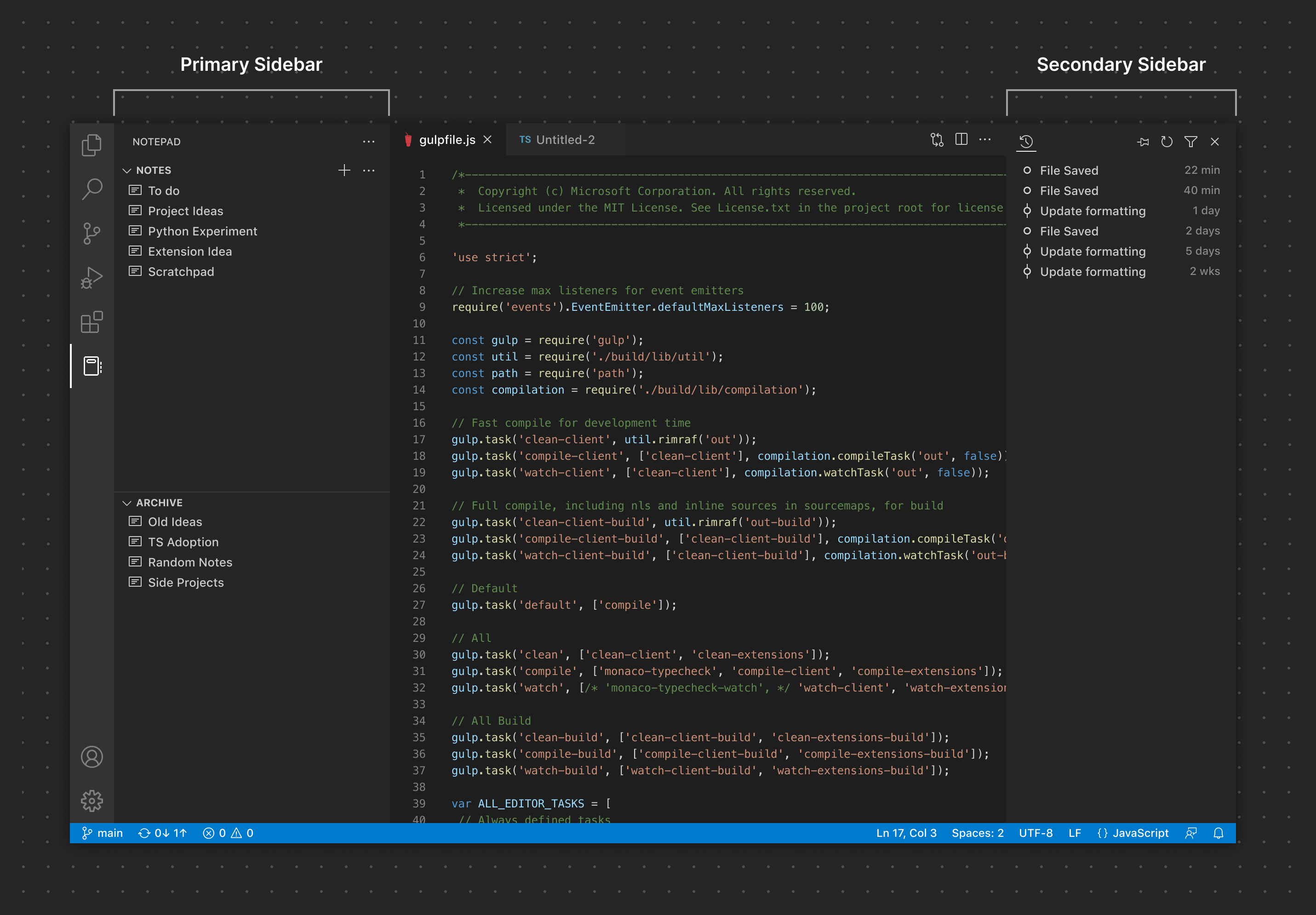
The Primary and Secondary Sidebars consists of one or more Views contributed by a View Container. Extensions can contribute Views to an existing View Container (for example, Explorer) or they can contribute an entirely new View Container.
✔️ Do
- Group related Views and content together
- Use clear, descriptive names for View Containers and their Views
❌ Don't
- Use an excessive number of View Containers. A single View Container (such as a Sidebar with Views unique to that extension) is generally enough for most extensions.
- Use an excessive number of Views (3-5 is a comfortable max for most screen sizes)
- Add content to the Sidebar that could be a simple Command.
- Repeat existing functionality
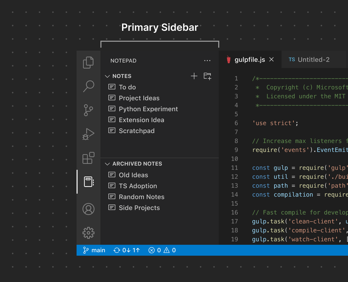
Primary Sidebar
Many extensions choose to contribute Views and/or View Containers to the Primary Sidebar given the high visibility it gives content. Use good judgement when adding content here—too much contributed UI can lead to a cluttered experience that can confuse your users.
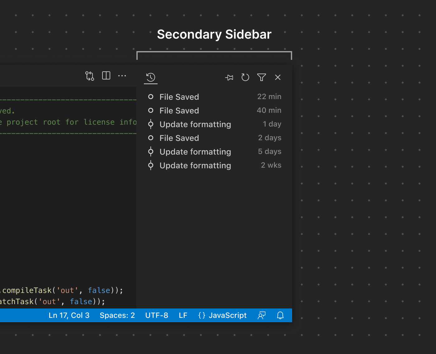
Secondary Sidebar
As the name implies, the Secondary Sidebar is normally considered a auxiliary location for Views. While extensions cannot contribute Views directly to it by default, users can drag Views from the Primary Sidebar or the Panel to customize their layout.
Sidebar Toolbars
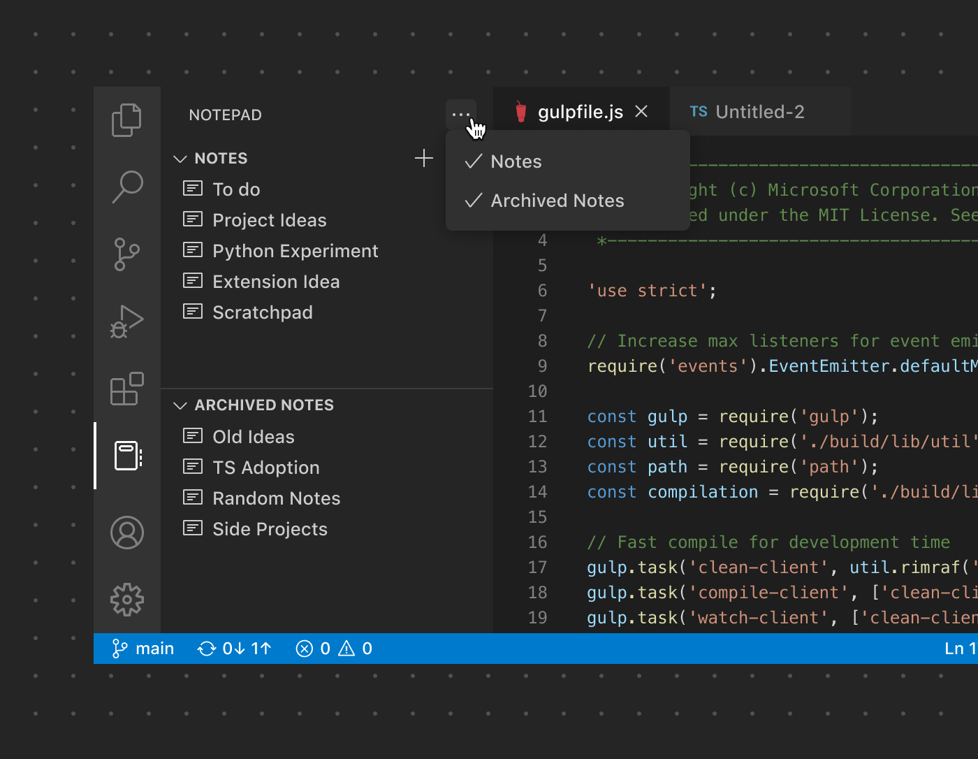
By default, View Containers in the Sidebar with more than one View will feature a single ... icon button in the Sidebar Toolbar to show and hide each View. That looks something like this:
However, if only one View is used, the Sidebar will automatically consolidate the UI to use the Sidebar Toolbar to render all of the actions specific to that View. In place of the ... button, the two actions associated with the 'Notes' View are rendered in its place:
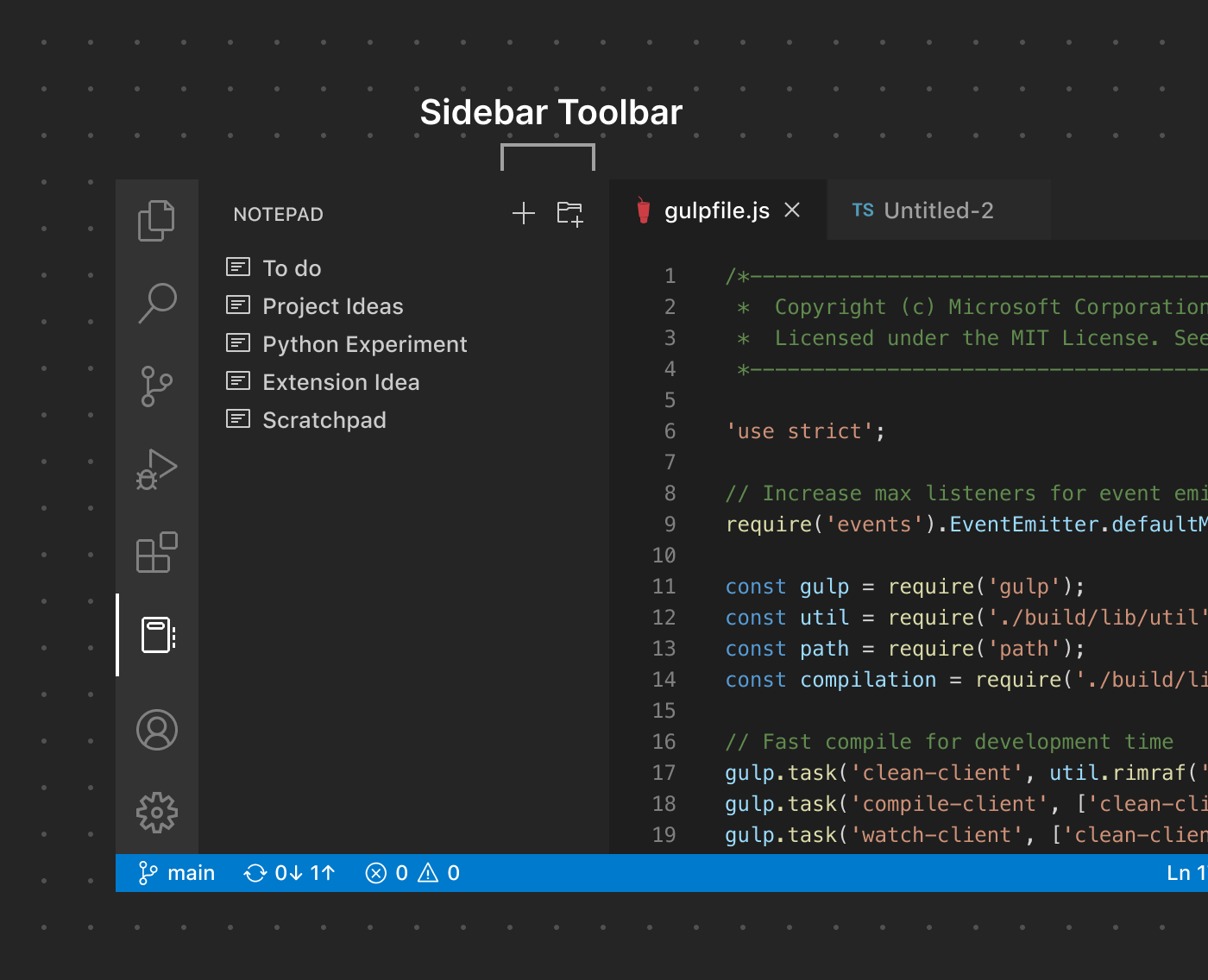
As with other toolbars, be careful to not add too many actions to reduce clutter and confusion. If possible, use an existing product icon paired with a descriptive Command name.