Panel
The Panel functions as another main area to display View Containers.
✔️ Do
- Render Views in the Panel that benefit from more horizontal space
- Use for Views that provide supporting functionality
❌ Don't
- Use for Views that are meant to be always visible since users often minimize the Panel
- Render custom Webview content that fails to resize/reflow properly when dragged to other View Containers (like the Primary or Secondary Sidebars).
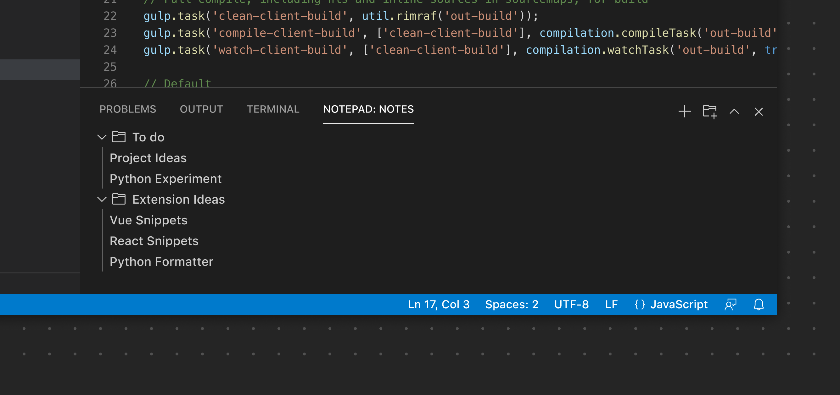
Panel Toolbar
The Panel Toolbar can expose options scoped to the currently selected View. For example the Terminal view exposes View Actions to add a new terminal, split the view layout, and more. Switching to the Problems view exposes a different set of actions. Similar to the Sidebar Toolbar, the toolbar will only render if there is just a single View. If more than one View is used, each View will render its own toolbar.
✔️ Do
- Use an existing product icon if available
- Provide clear, useful tooltips
❌ Don't
- Don't add an excessive number of icon buttons. Consider using a Context Menu if more options are needed for a specific button.
- Don't duplicate the default Panel icons (collapse/expand, close, etc.)
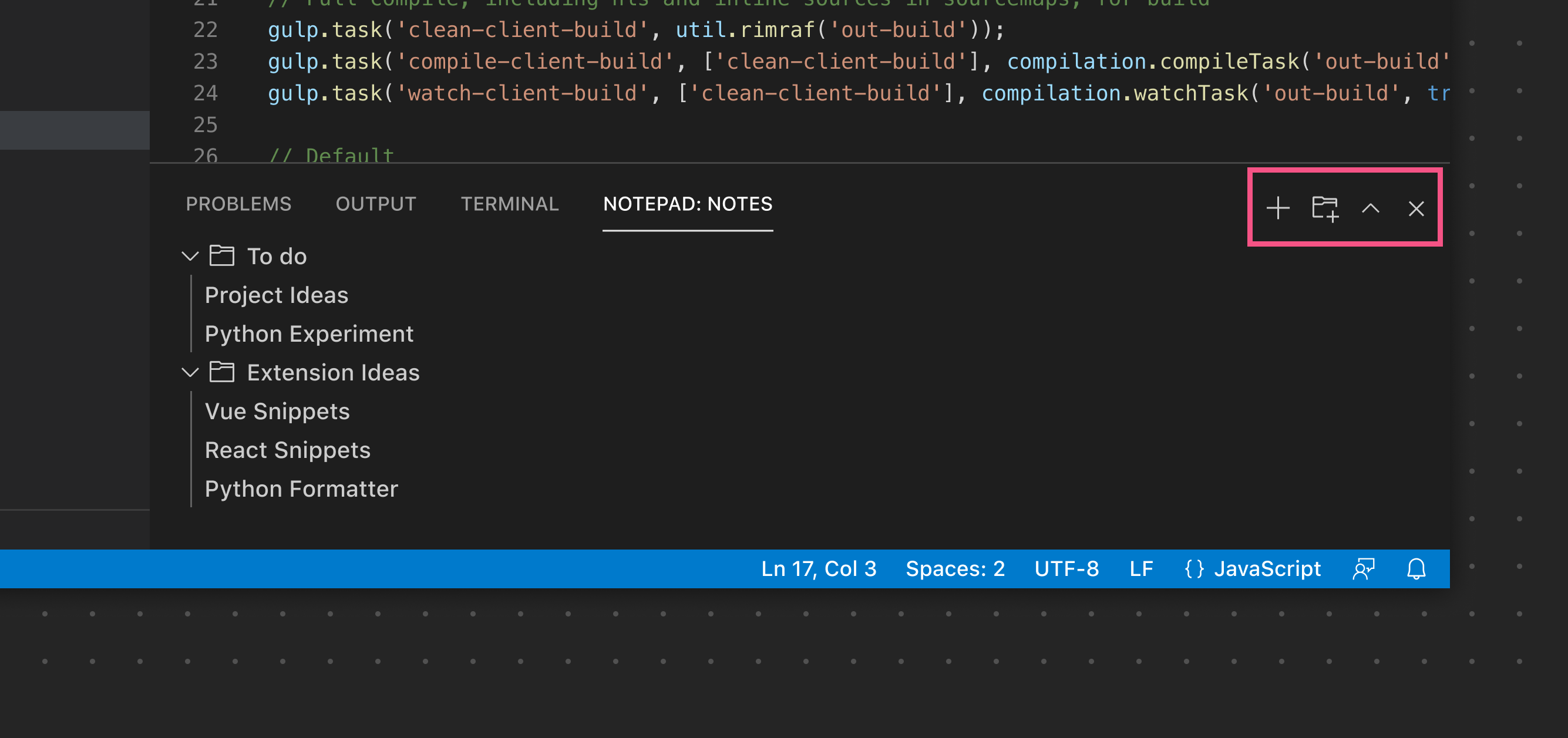
In this example, the single View rendered in the Panel renders its View Actions in the main Panel Toolbar.
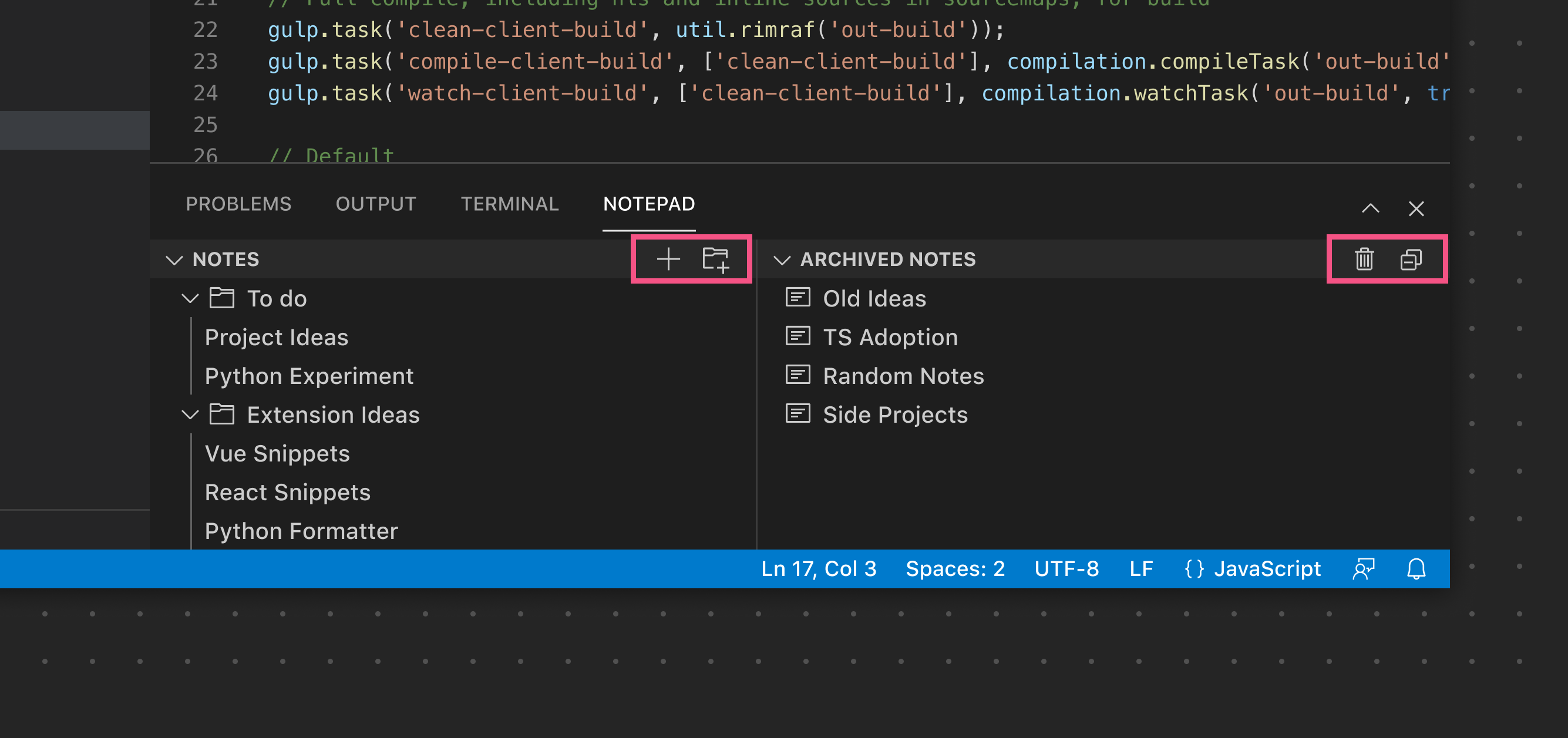
In this example, multiple Views are used, so each View exposes its own specific View Actions.