Modernizing the VS Code UI
October 15, 2026 by Lee Murray
VS Code has changed a lot since its first preview in 2015. Tabs, themes, and new ways to organize your work have made it more capable, but over a decade of adding and refining features has also introduced visual complexity and inconsistencies across the workbench.
This modernization isn't about reinventing the editor. We're refining the familiar interface to make its hierarchy clearer, reduce distractions, and give VS Code a shared design foundation that can support both editing and newer workflows such as agent sessions. The goal is a more coherent, approachable experience without giving up the density, customization, or muscle memory developers rely on.
The modernized UI is available today in preview. The work began with the 2026 color themes, expanded through the Agents window, and is now shaping the editor itself. In this post, we'll share how the modernization evolved and how your feedback continues to shape it.
An interface that's always evolving
Some interface changes have been small refinements. Others have introduced new ways to organize your work. Even features that now feel like part of the original editor arrived gradually.
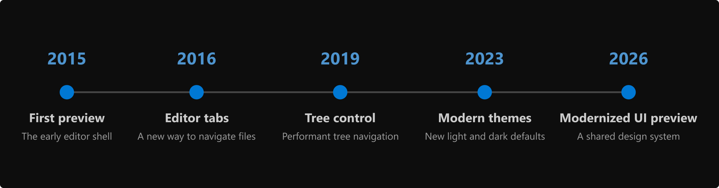
The timeline highlights the first preview in 2015, editor tabs in 2016, the new tree widget in 2019, the Dark Modern and Light Modern themes in 2023, and the modernized UI preview in 2026.
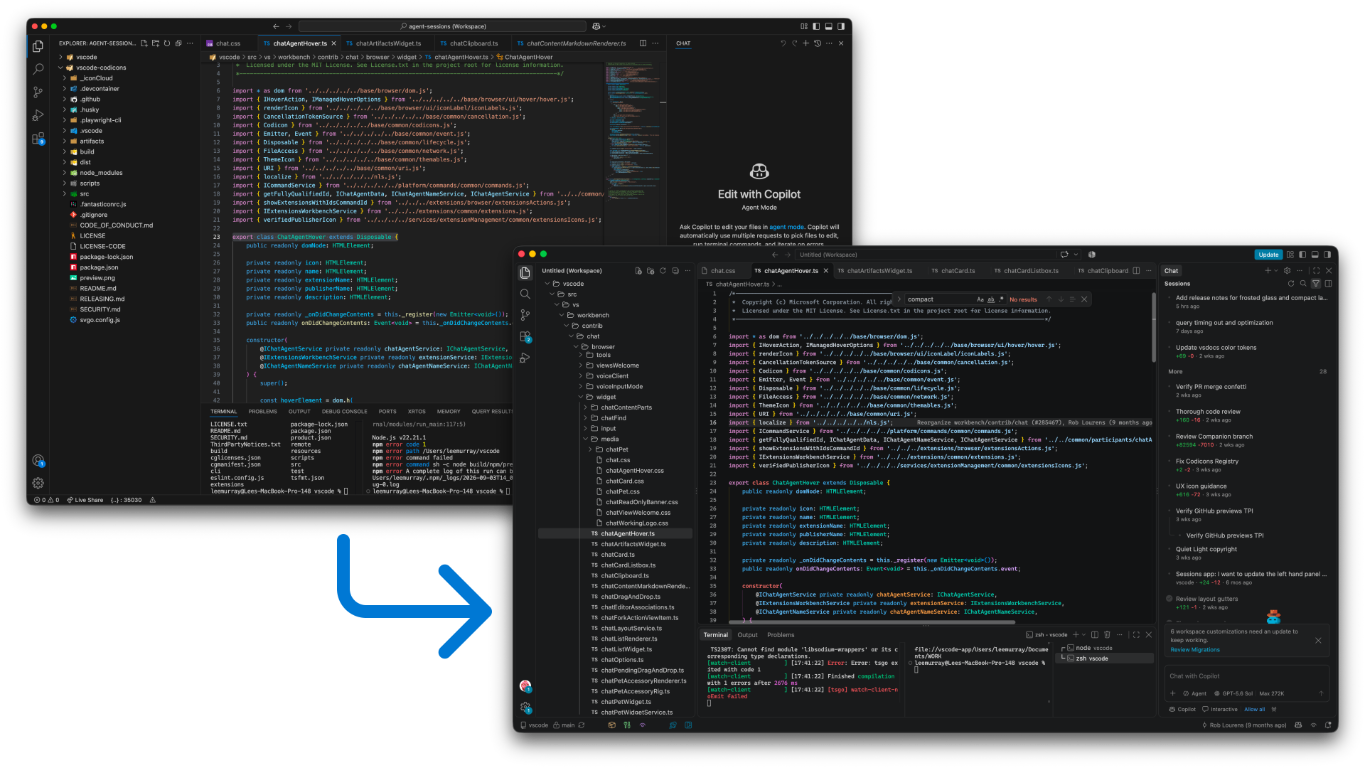
The previous workbench design, which we refer to as the classic UI, and the modernized UI preview.
We continued refining each feature after it was introduced, guided by feedback across different themes, layouts, and workflows. The current modernization follows the same approach.
The first step: color
Color is part of how you make VS Code your own, but it also shapes how quickly you can read the interface. A balanced palette helps important content and states stand out without making every part of the workbench compete for attention.
We began the modernization journey by rethinking color with the Dark 2026 and Light 2026 themes. We looked at workbench colors and syntax highlighting as one experience, establishing a visual foundation that we later carried into the modernized UI. A tighter range of surface colors creates a clearer hierarchy and keeps code at the center. More consistent hover, focus, selection, validation, and agent states help the interface read clearly in both light and dark environments.
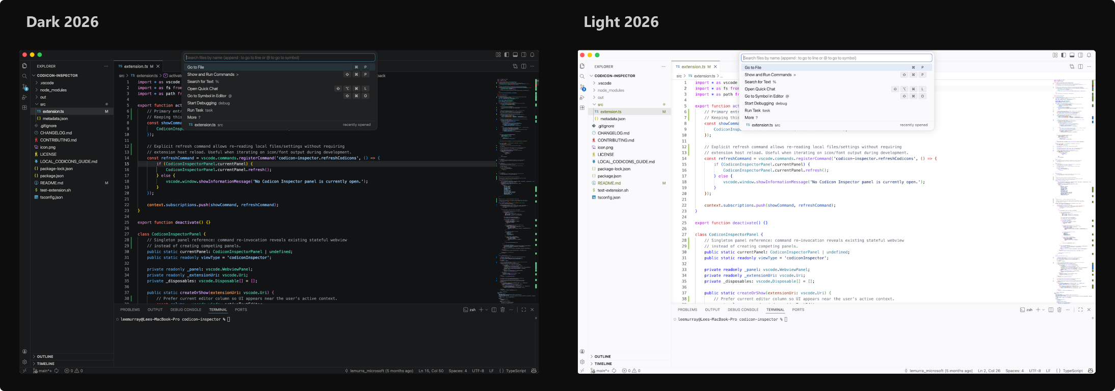
Dark 2026 and Light 2026 themes.
Color gave us a starting point, but creating a more cohesive interface required shared rules for spacing, typography, surfaces, and controls. The opportunity to develop those rules came with a new kind of VS Code window.
One VS Code, different ways of working
The Agents window became available in Stable as a Preview earlier in 2026. It brings the full agent workflow into one place, from starting sessions and following progress to reviewing results. It represents a new way of working in VS Code, centered on delegating tasks and reviewing work as it progresses. Supporting that shift called for a fresh approach to the interface, so session state and next actions remain easy to scan without crowding the prompt and review areas.
We're aligning the Agents and editor windows around the same approach to typography, spacing, colors, tabs, and controls. Moving between them should feel like changing how you're working, not switching to a different product. That doesn't mean making the layouts identical or making everyone's VS Code look the same. Each window remains optimized for its purpose, and you can still choose a theme, adjust density, and arrange your workspace to suit your screen and workflow.
The existing workbench was designed around direct interaction with files and had evolved component by component. Spacing, typography, surfaces, and controls didn't always follow a shared system, which made it harder to adapt the interface to this new workflow or carry improvements across windows. The Agents window gave us a place to develop that shared design system.
We worked through those design decisions together and tested how they supported managing sessions, following progress, and reviewing changes. The result was a shared visual language we could refine across VS Code, not a separate identity for the Agents window.
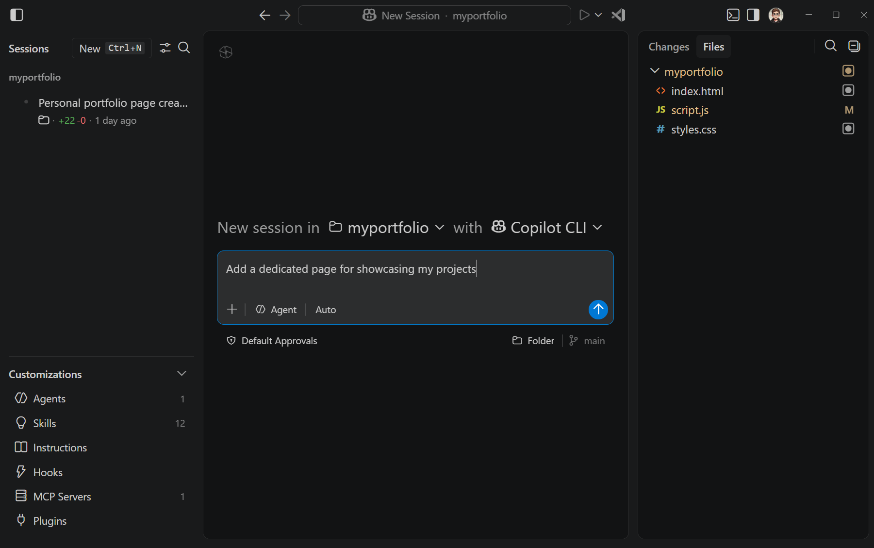
The Agents window organizes the interface around agent sessions and reviewing their work. The screenshot shows an early implementation of the updated design system.
Once those decisions worked together in the Agents window, the next question was whether the same system could support the editor. The editor brings different demands, including dense file navigation, multiple editor groups, and long-established workflows.
Bringing the shared system into that environment became the next phase of the modernization. Rather than redesigning file editing itself, we started with the shared workbench shell: the foundational areas and controls people see and use across workflows. These elements define how the interface is organized and how people move through it. Starting there let us improve consistency while preserving dense navigation, multiple editor groups, and long-established patterns.
As the workbench had grown, related parts such as the Activity Bar, side bars, editor groups, panel, tabs, and status bar had developed different approaches to common design problems. The initial work focused on:
- Separating major areas of the workbench clearly without making them feel disconnected.
- Making controls for resizing and moving panels easier to discover.
- Simplifying typography and visual hierarchy so your work remains the focus.
- Using a consistent approach to spacing, corner radii, colors, and elevation.
- Refreshing tabs while preserving customization.
Shared design tokens provide named values for spacing, sizes, and colors instead of defining them separately in every component. This lets us adjust the interface consistently and support different densities and themes.
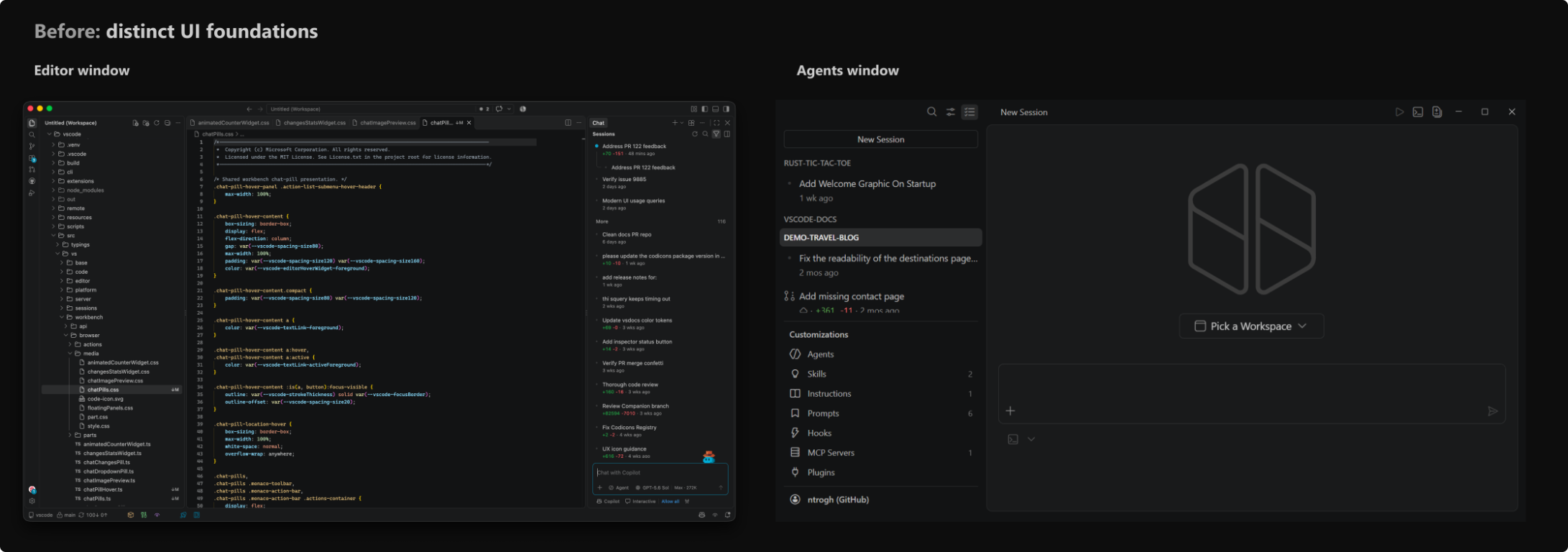
Earlier: the editor and Agents experiences began with layouts shaped independently around their workflows. For a like-for-like comparison, both windows use Dark 2026 and are shown at the same size.
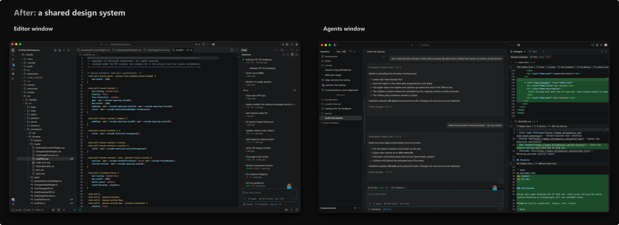
Now: a shared design system creates a stronger family resemblance while each window remains optimized for its purpose. Both windows use Dark 2026 and are the same size.
Rolling out and learning from feedback
We introduced the modernized UI gradually so we could learn from increasingly broad groups of developers before making it the default. It first appeared as an experimental setting in Stable and was enabled by default in Insiders. We then ran a controlled experiment in Stable for a subset of users. After learning from that rollout, we enabled it by default while keeping the option to return to the classic UI during the transition.
As the preview reached more people, our design assumptions met the realities of different displays, zoom levels, themes, and workflows. We opened a public feedback discussion, and developers shared dozens of detailed examples. We combined that feedback with individual issue reports and team self-hosting to identify patterns rather than treating any screenshot or preference as universal.
Several common themes emerged:
- Overall density: Gaps and panel padding left less room for code, tree rows, and terminal output, particularly on smaller displays and layouts with several editor groups.
- Editor tabs: The pill design made the active file feel detached from its editor, while tab labels and actions competed for limited horizontal space.
- Status bar: Wider item spacing reduced how much information fit before items were hidden.
- Panel boundaries: Separators and resize controls needed to be easy to find without becoming visually distracting.
- Theming and contrast: Theme users and authors needed more control over new surfaces, borders, and active states.
- Responsiveness: Some reports called out rendering performance as the workbench updated.
On a 1920 x 1080 display at 100% zoom, the modernized UI currently uses approximately 20 px more horizontal space and 12-18 px more vertical space, depending on layout. We added space to separate content and make controls easier to find, but that also leaves less room for your work. Your feedback highlighted the importance of offering a better balance for different layouts.
How your feedback changed the design
Layout density
You told us that a more spacious interface wasn't an improvement if it meant seeing less of your code or project. That feedback led us to implement Layout Density.
Compact density reduces spacing while keeping the structure and customization of the modernized UI. It's designed for smaller displays, information-dense workflows, and anyone who prefers a tighter layout.
Combined with theme and color customization, it can give you a layout closer to the previous interface while keeping the new foundation.
To use compact density, open Customize Layout from the title bar and select Layout Density > Compact, or set window.density.layout to compact.
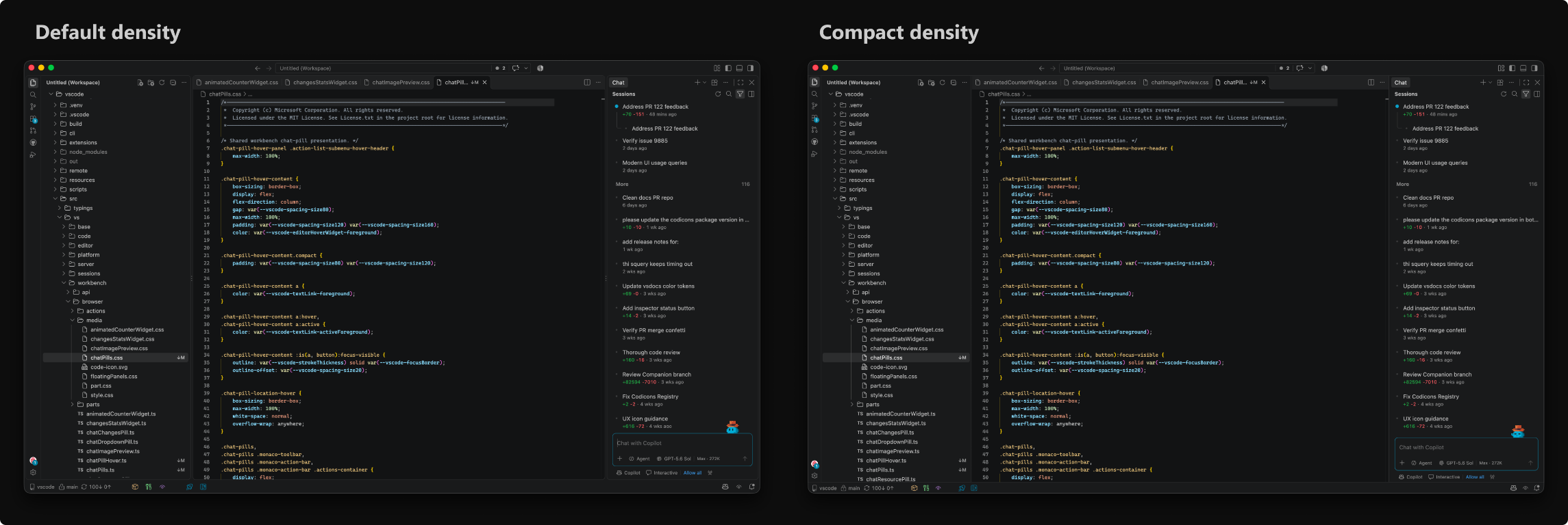
Default density and compact density, shown with the same window size, theme, open views, and editor content.
Redesigned editor tabs
More recently, feedback about editor tabs prompted us to revisit their design. You use tabs to navigate files and see which content is active, so their relationship to the editor matters.
The initial pill-shaped tabs appeared as separate controls above the editor. That made the selected file harder to connect visually with its content, especially in themes with subtle active-state colors. With connected tabs, the selected tab joins the editor surface below it. The tab and its content appear as one continuous area, restoring a familiar cue for the active file.

Pill tabs and connected tabs, captured from matching production component fixtures.
If you prefer the pill design, you can still select it using the workbench.experimental.modernUIEditorTabStyle setting.
Smaller workbench refinements
Feedback also led to smaller changes across the workbench:
- Simplified typography and removed all-caps labels.
- Refined spacing, corner radii, and colors for a more consistent hierarchy.
- Adjusted panel separation and resize controls.
- Provided more controls for editor tabs.
- Revisited status bar spacing.
- Expanded theme customization for modernized UI elements.
You don't have to change any settings to use these refinements. The following optional settings provide more control:
workbench.experimental.modernUIUppercaseViewHeadersuses uppercase text for view headers, side bar titles, and panel tabs.workbench.activityBar.compactuses a narrower Activity Bar size that frees up more horizontal space in the UI.workbench.editor.tabActionReserveSpacecontrols whether tabs in the modernized UI always reserve space for action buttons. Turn it off to give clean inactive tabs more room.
Settings with experimental in their name can change or be removed as the design stabilizes. The other settings are supported customization controls, not required migration steps.
What the modernized UI means for theme authors
Color themes are one of the main ways developers make VS Code their own, supported by a vibrant community of theme authors. As we updated and expanded the built-in themes for the modernized UI, we also exposed the new color controls to extension authors.
Existing themes remain compatible with both the modernized UI and the classic UI. The new color IDs for the modernized UI fall back to established workbench colors, so themes that don't define them keep their existing palette.
Theme authors can opt into the new IDs for finer control over surfaces, borders, tabs, the Activity Bar, and window states. The IDs are experimental, so test any overrides in both the modernized and classic interfaces, and across light, dark, and high-contrast themes.
The theming guide for the modernized UI documents the complete token list, defaults, precedence rules, high-contrast behavior, and examples. The existing Color Theme guide explains how to package and publish a theme extension.
Keeping the modernized UI responsive
Visual consistency can't come at the cost of responsiveness. Some feedback reports called out rendering performance, so we investigated with browser traces and repeatable benchmarks.
When the UI changes, the browser recalculates which styles apply. Broad CSS selectors can make that work more expensive than necessary. In the first set of selector fixes, we replaced selectors that inspected large parts of the DOM with state classes that components already knew, such as whether the diff overview or a debug action was present.
We measured those changes with a repeatable sequence of common workbench interactions: resizing, switching views, scrolling, opening diffs, and running widget animations. The fixes reduced style-recalculation time by 8.2% and wall-clock time by 3.3% in that combined benchmark. Layout time increased by 6.6%, so the result recovered some of the difference from the previous interface, but not all of it.
These are targeted improvements rather than a claim that the whole workbench became faster. To prevent the same patterns from returning, lint rules reject known expensive selectors, and npm run perf:css gives us a repeatable benchmark for future changes.
Where we go from here
The modernization is still evolving. Today, you can choose between the updated interface and the previous VS Code workbench design, which we refer to as the classic UI. Over time, we plan to retire the classic UI so we can focus improvements on a shared foundation.
During the transition, you can return to the classic UI by opening Settings, searching for workbench.experimental.modernUI, and clearing the checkbox. This option is temporary, although we haven't set a date for removing it. We'll share the timeline and give you advance notice before the transition ends.
Before then, we'll continue to:
- Align shared controls and styling across the Agents and editor windows while preserving what each workflow needs.
- Continue refining Dark 2026 and Light 2026 through feedback on contrast, readability, and syntax colors.
- Refine tab styling and customization.
- Profile rendering costs and validate further improvements with repeatable workbench measurements.
- Adjust density, layout controls, and other details in response to specific feedback.
- Make Layout Density and related customization easier to discover.
Thank you for helping us improve the design. The larger updates and smaller refinements across the workbench reflect what we've learned from you. Please keep sharing what works and what gets in your way. You don't need design terminology or a proposed fix. A screenshot and details about your display, zoom level, theme, settings, and workflow help us understand the problem. If you return to the classic UI, tell us what the updated interface needs to improve before it becomes the only interface.
Share feedback or report an issue
Happy coding! 💙